System-wide dark mode is the new trend in design language. Mainstream operating systems, like Microsoft Windows and macOS from Apple, have already incorporated native dark mode support. Third party apps are also part of the race, although the implementations are not always welcomed.
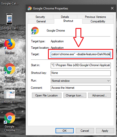
However, smartphone users are lagging in this field. Android and iOS are the mainstream operating systems for the phone and tablet community, but none of them properly support dark mode yet.
Thanks to the customizability of Android, multiple vendors came up with their in-house dark mode feature as a part of custom skin. Google also recognized the power saving capability of dark mode (also known as night mode), if paired with compatible hardware (like AMOLED display).
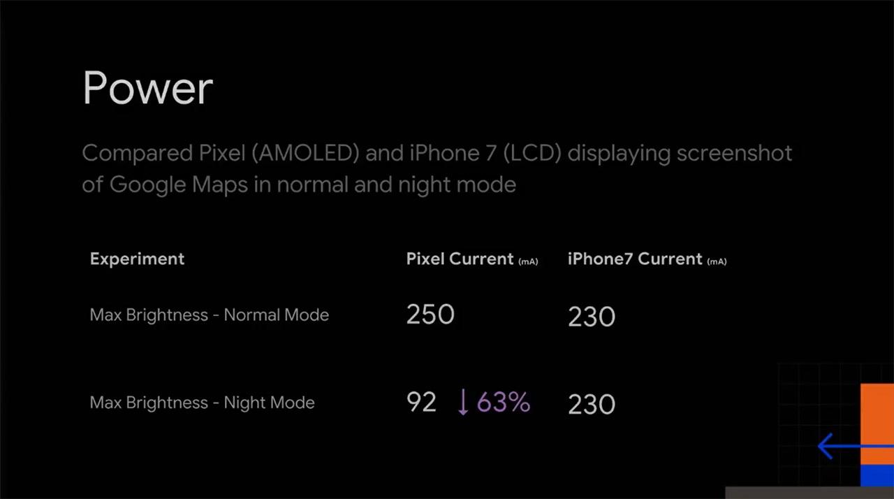
The Mountain View giant is, in fact, slowly preparing for dark mode support. Vanilla Android Pie features a night mode toggle under Developer options, while stock Google apps are gradually being optimized for a darker themed UI.
This tendency of converging towards a unified dark mode settings is also beneficial of third party app developers. In past, they had to create custom routines for supporting black/dark UI. As a consequence, end users faced a weird UI/UX across different platforms.
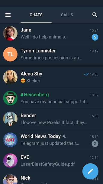
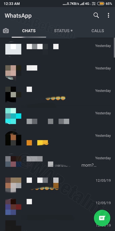
Popular messaging app WhatsApp is internally testing dark mode support for a while, although there is no ETA about public rollout. Independent WhatsApp update tracker WABetaInfo has spotted a number of unreleased features of the new UI in the recent builds of the app.
In the precendent article about the 2.19.139 beta update, we have confirmed that the Dark Mode was actually a Night Mode, adding the compatibility for the chats list, status and calls sections.
In this update, WhatsApp is working to implement the Night Mode in other sections. The first one is the Contact Picker section, completely ready.
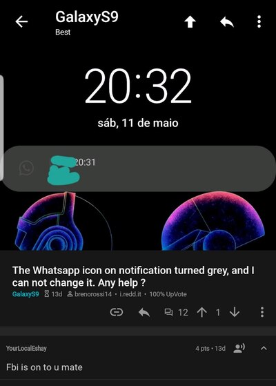
Looks like Facebook (the parent company of WhatsApp) engineers are randomly flipping some switches at the server side, as several WhatsApp users have reported to notice the change of color in the notification and widget of WhatsApp on Android.
Does anybody know why since the last update my WhatsApp notifications are grey? Even in the always on display the WhatsApp logo is showing in grey color
(Source)
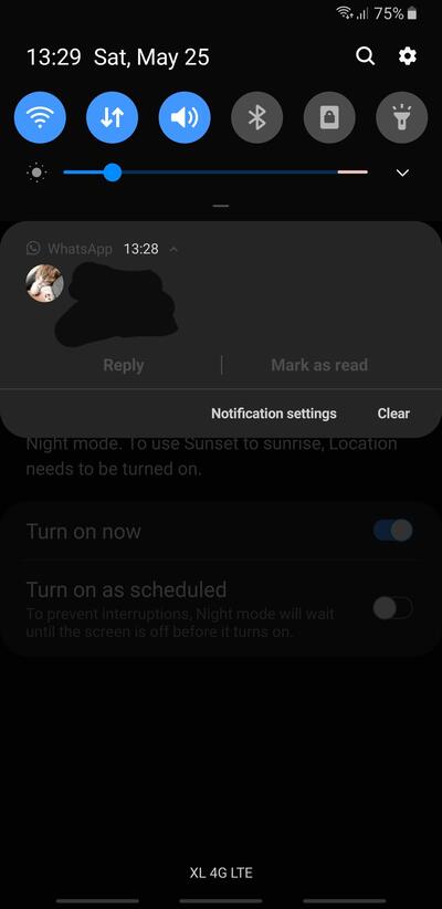
I noticed the same thing happening to my phone recently. I do have Good Lock’s QuickStar enabled, but I only use the options to show/hide icons on the notification bar, haven’t applied any settings related to coloring or something like that.
But for me pretty much the one affected is Whatsapp, other apps still show colors on the notifications.
(Source)
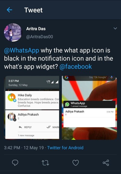
Although the reports are seemingly random in terms of origin and model of phones, there is an interesting pattern among them. A huge chunk of the feedback arrived from Samsung Galaxy S series users, where Samsung One UI natively supports system wide dark mode.
In other cases, the theme engine or the dark shade of the wallpaper triggered the (partial) night mode like UI in WhatsApp.
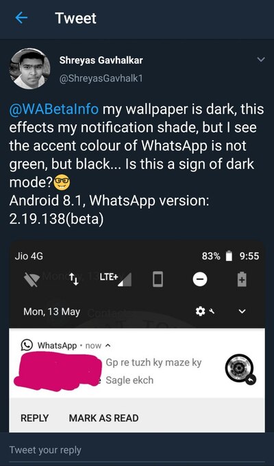
They’re preparing to rollout dark mode on Android hence the dark icon in notifications.
I clicked on a contact to see the phone number and the screen went all dark gray for a second before turning back to its normal white and green.
Can’t wait till they roll it out. WhatsApp is one of the few apps on my phone that doesn’t have native dark mode and it’s a bitch to use in the dark.
(Source)
Judging from the timeline of these reports, WhatsApp has started preparation of this A/B testing since last few days after pushing the 2.19.145 beta build of their Android app.
It could be possible to expand the testing phase further to support more devices, but we are not very certain about that.
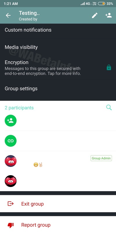
Due to the growing reports regarding this experimentation and the status of the UI, we assume that the dark mode feature of WhatsApp should be available via stable channel very soon.
Have you noticed such changes in the WhatsApp app on your phone? Comment below.
PiunikaWeb is a unique initiative that mainly focuses on investigative journalism. This means we do a lot of hard work to come up with news stories that are either ‘exclusive,’ ‘breaking,’ or ‘curated’ in nature. Perhaps that’s the reason our work has been picked by the likes of Forbes, Foxnews, Gizmodo, TechCrunch, Engadget, The Verge, Macrumors, and more. Do take a tour of our website to get a feel of our work. And if you like what we do, stay connected with us on Twitter (@PiunikaWeb) and other social media channels to receive timely updates on stories we publish.

