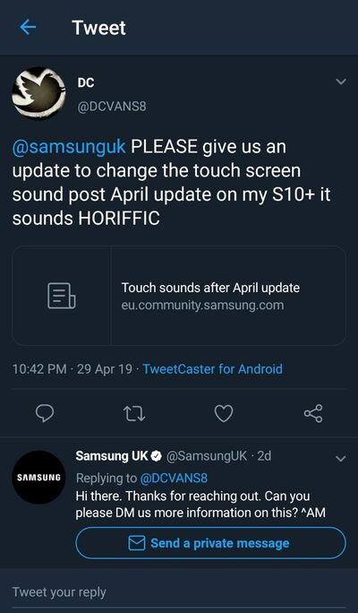
Massive transition is always hard for typical end users. Apart from real life events like implementing a new law or the decision to leave a political-cum-economic union (cough… Brexit… cough), people often react harshly on events like a rather small change of touch sound.
We have seen similar events with common operating systems like Windows as well. To make the OS more mobile/tablet friendly, Microsoft decided to remove the familiar start button with the introduction of Windows 8. They replaced it with a start screen, which was optimized for touch screen usage.
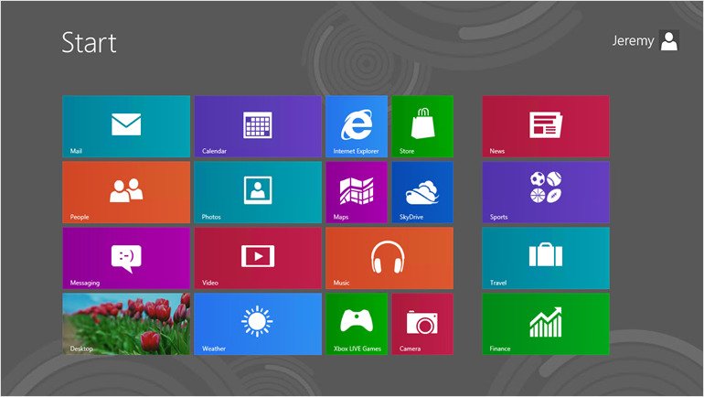
Nevertheless, majority of the Windows community hated the new design. Microsoft tried to handle the situation by bringing back the start button in Windows 8.1, and later the Redmond giant recreated a ‘modern’ start menu in Windows 10.
The user sentiment is very fragile; handle with care!
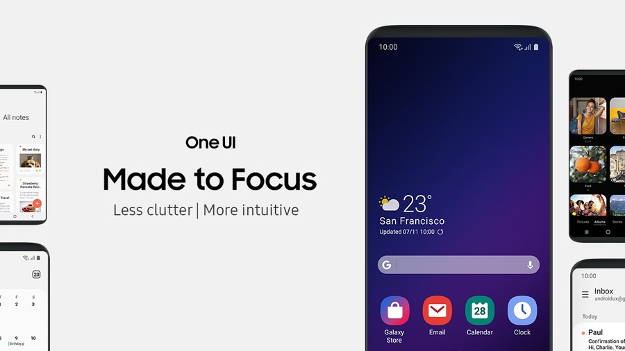
Being one of the largest Android OEM, Samsung also chose the path to tinker with the user interface of their in-house skin of Android. The latest and greatest version is called One UI, which came out of the box with Samsung Galaxy S10 lineup.
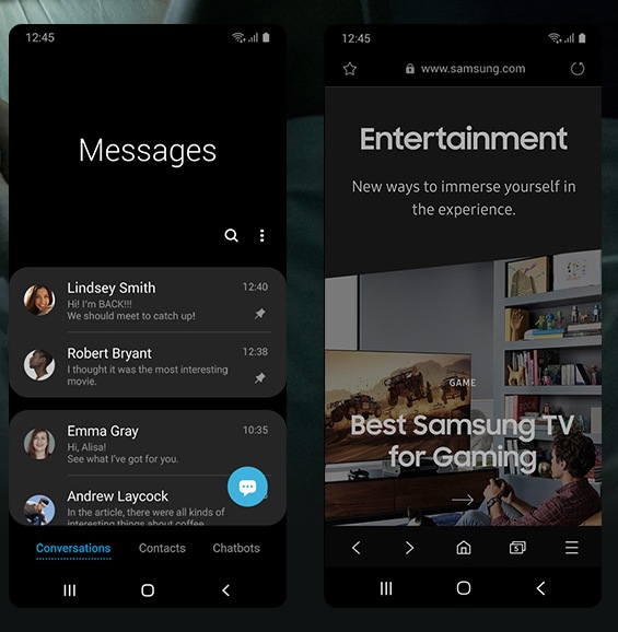
The development of One UI started back in 2018. This new interface, which was itself based on the foundation of Android 9.0 Pie, was designed to replace the aging Samsung Experience UI found in existing phones from the Korean OEM.
Initially known as Samsung Experience 10, an early build of One UI was leaked in September 2018. The Samsung community discovered the glimpses of the upcoming changes, such as a native AMOLED friendly dark mode, card style UI with curved edges and a revamped Recents menu.
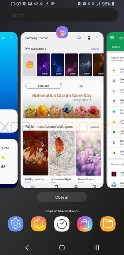
The leaked build was intended for Samsung Galaxy S9 (the US Snapdragon variant). Eventually Samsung started a public beta testing via Samsung Members app where interested users could enroll for getting the first taste of the future software update for their Galaxy S9/S9 Plus.
At the end of December 2018, Samsung started to gradually roll out the final One UI build for European Galaxy S9/S9+ users. The software build version for Galaxy S9 and Galaxy S9+ were G960FXXU2CRLI and G965FXXU2CRLI respectively.
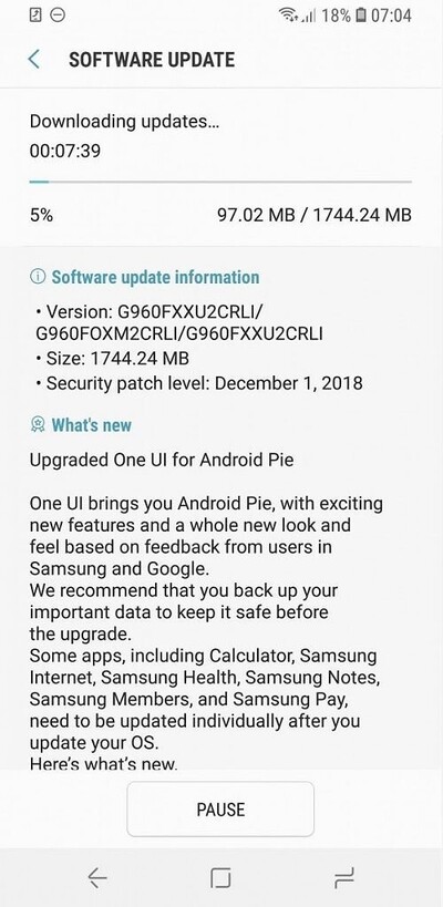
In subsequent months, the rollout became broader and most of the Galaxy S9 users got the update of One UI based on Android Pie. However, the overall reception of the new UI is far from good among the S9 community.
What kind of update is this samsung? This is horrible update…you guys made the phones harder to use now… the split screen is a nightmare to get into… do i say i dare go back to apple?? First Samsung is my s8 now and seriously was considering the s10 but with this operating system im not so sure now. I realy hope you and google fix this fast before your sales suffer… read the posts.. no one like android pie!!!!!! Awfull!!!! I just cant believe google and samsung did this… had such a good streak going to
(Source)
SHOCKINGLY BAD UPGRADE!
What the actual eff? Totally agree with people saying it makes your phone look like some child’s toy.
Not only cosmetics, but the actual functionality of some basic apps (messaging n gallery for example) are just incredibly fiddly and kind of add yet more boxes withing the app itself.
Samsung, you really have dropped the ball on this one. Need a patch NOW, to replace this joke.
Got to keep bouncing threads like these, because it is an appalling downgrade and I am sure we are not the only ones who think this.
(Source)
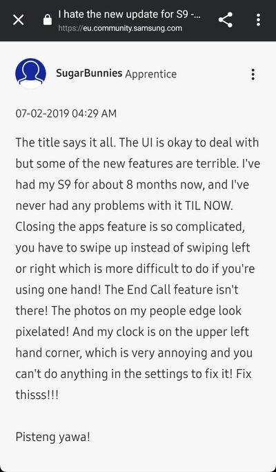
Most of the regular users can’t handle the new rounded UI or the default theme/icons. While features such as the night mode is getting praise, subtle changes like the clock position, Recents UI or the revamped lock screen are drawing negative reviews.
I hate that the time at the top is on the left now. The notifications on the lock screen are really annoying now, you have to tap the thing to actually see them. I’ve also noticed that all the passwords that were saved with my fingerprint aren’t working anymore, also there is no option for using fingerprint to get onto secret mode on Samsung internet anymore. This new update is the worst Samsung have ever done.
I wish they would just revert back to the last update because this one is so cheap looking. Another thing is I quite liked getting rid of the buttons at the bottom and having to swipe up to see them, I don’t understand why that’s not a possibility anymore. Not to mention you can’t turn off the Bixby button anymore, only to one press or two. This update has legitimately ruined my day…
(Source)
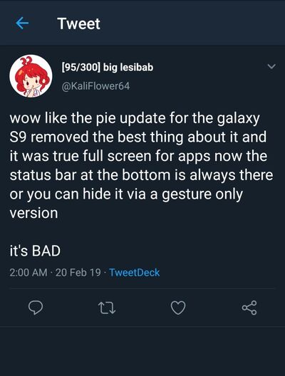
Some of the UI elements can be changed by switching to a different launcher paired with third party icon packs. However, the user base we are addressing here don’t want to jump through whoops to get things done. They bought a ‘Galaxy’ phone to stick with the sophistication for a while.
I totally agree. I went to sleep excited to see the new update and when I saw it I wanted to die. My phone looks hideous! So childish! And no theme I use makes it look anywhere near the way it looks before. I bought Samsung because of the sophisticated way it looked, now I’m messaging everyone I know who has it that it that in case they want the update, it looks like this! Please Samsung change the way it looks, I’m devastated!!!
(Source)
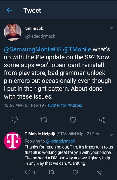
With the growing amount of negative feedback against the overall UI changes, the buggy front camera issue after recent update have made the situation a convoluted mess.
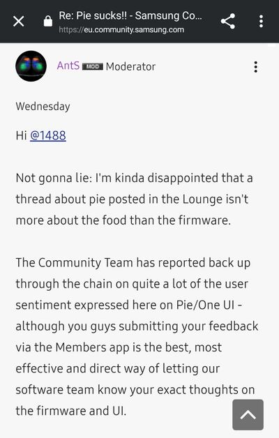
A Samsung EU forum moderator has suggested users to post their feedback directly to the development team via Samsung Members app, so that they could be treated properly.
At this moment, the Galaxy S9 community can only hope that Samsung will listen to their feedback and fix the annoyances in future updates. Don’t forget, even Microsoft needed to change the UI elements after facing enough backslash from the users.
Do you like the One UI update in your Galaxy S9/S9+? Comment below.
PiunikaWeb is a unique initiative that mainly focuses on investigative journalism. This means we do a lot of hard work to come up with news stories that are either ‘exclusive,’ ‘breaking,’ or ‘curated’ in nature. Perhaps that’s the reason our work has been picked by the likes of Forbes, Foxnews, Gizmodo, TechCrunch, Engadget, The Verge, Macrumors, and more. Do take a tour of our website to get a feel of our work. And if you like what we do, stay connected with us on Twitter (@PiunikaWeb) and other social media channels to receive timely updates on stories we publish.

