OnePlus rolled out the stable Android 10 update to OnePlus 6 and OnePlus 6T as OxygenOS 10.0.1. This came after the initial OxygenOS 10.0.0 update was halted due to bugs.
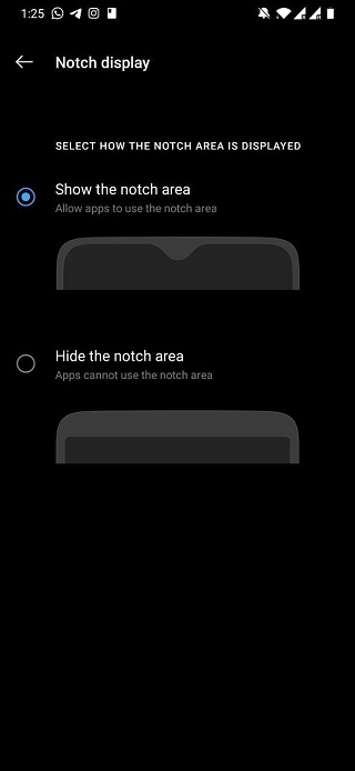
Although the arrival of the said OxygenOS 10.0.1 was met with smiles after a long period of waiting for the update, not everything about it was perfect. For some reason, the option to hide the notch that was part of Android Pie had been dropped.

Of course, not everyone who purchased either OnePlus 6 or 6T is a fun of the notch. Some want the phones, yes, but none of that cutout stuff that houses the front camera.
This is where the option to hide the notch area came in and when it was dropped, owners of both OnePlus 6 and 6T weren’t happy. To make amends, OnePlus brought back the feature with the most recent update to OxygenOS 10.3.0.

Unfortunately, though, this feature doesn’t work like it used to back when the phones were running Android Pie. Usually, hiding the notch area would leave a full-width status bar at the top. This area housed things like notifications, time, battery level, and other icons.
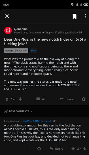
But the implementation in OxygenOS 10.3.0 is far from ideal, where the status bar at the top now appears below the notch area, thus leaving the area that housed notifications and other icons unused.

When updating to 10.3.0 i see that OnePlus finally implemented the “Hide Notch” feature, however this has to be the worst, shittiest implementation of it. It was perfect on OxygenOS 9, where it put the clock, battery etc on the notch area, and just kept the background black, so videos and games wouldn’t use that area and you’d never see the notch. Now it just keeps the notch area black, and puts everything else below it, leaving the upper part of the screen completely unused.
Source
I just installed the new update for my Oneplus six (OxygenOS 10.3.0 / Android 10) and noticed that my status bar is now displayed below the notch area, unless I set my notch settings to “display notch area”. Before, when I set it to hide notch, my status bar would be displayed in the black bar next to the notch, which was very elegant. Now I only have the option to not use that area at all ot to have it fully turned on. Minor complaint, but I really liked the way OxygenOS used to handle this.
Source
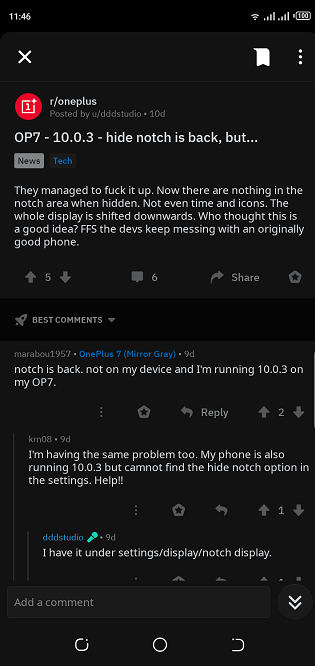
Interestingly, a similar issue is also affecting owners of the OnePlus 7 following the update to OxygenOS 10.0.3.

On the brighter side, though, there seems to be a workaround and even though not perfect, some of those who have applied it are pretty much content with what it offers compared to what OxygenOS 10.3.0 has.
Step 1: Open the Google Play Store and download the SetEdit app (Settings Database Editor).
Step 2: Launch the app and select System Table.
Step 3: Search for “op_camera_notch_ignore.”
Step 4: Tap on it and set the value to “1” and Save.
It’s worth noting that keeping the SetEdit app installed on your phone isn’t mandatory as long as you’ve made the changes. But as noted, you might not find this workaround to be the perfect alternative to the built-in option that was with Android Pie.
Hopefully, OnePlus will bring back the ideal way of hiding the notch while maximizing the space around the notch for things like notifications.
NOTE: We have more OnePlus related coverage here.
PiunikaWeb started as purely an investigative tech journalism website with main focus on ‘breaking’ or ‘exclusive’ news. In no time, our stories got picked up by the likes of Forbes, Foxnews, Gizmodo, TechCrunch, Engadget, The Verge, Macrumors, and many others. Want to know more about us? Head here.


