Google Chrome is probably one of the most used web browsers out there for either smartphones or PC/laptops. Moreover, Google always tries to bring in new features for Chrome, every now and then.
In fact, the new features are tested out in the bleeding edge developer build version of Google Chrome i.e. the Canary channel. It allows the users to test out the experimental features first-hand before they are pushed in with the stable (even beta) updates.

Besides, some of these new features are made available for Google Chrome as flags, which you can enable manually by typing in “chrome://flags” on your browser. Then you can enable and tweak with the new features that are available.
With the help of flags, you can enable different new features that have been pushed for experimental usage and once it is free from bugs and glitches, Google pushes those features via an update.
Notably, Chrome Canary is unstable due to the fact that new features are being tested on it but, you can use it for casual web browsing and experiencing the new changes and enhancements.
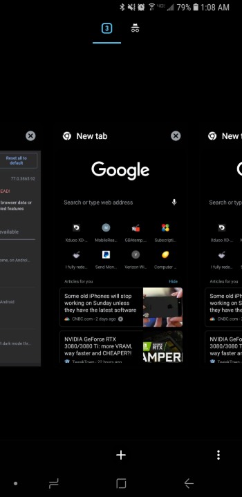
Back in April 2018, Google tested out a horizontal tab switcher for Google Chrome in portrait mode. With the help of this, the cards will be lined up horizontally when the user is in landscape mode whereas the tabs will be lined up vertically when the device is in portrait mode.
chrome://flags#enable-horizontal-tab-switcher
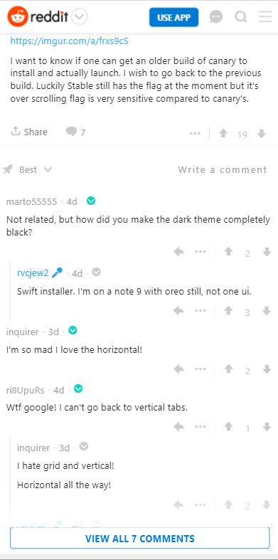
However, according to users on Reddit, the horizontal tab switching flag has been removed from Google Chrome Canary 80.

You can check out the image below, which is shared by one of the users running the latest Canary build of Google Chrome on Android.

Moreover, we also checked for the horizontal tab switching flag with no luck. Seems that Google had a different opinion on this feature that users liked.

We are not sure if Google wants to phase out the ability to use vertical tab switching which is still default in the stable channel (v78).
Let us know in the comments below if you prefer the horizontal or vertical tab switcher UI.
PiunikaWeb started as purely an investigative tech journalism website with main focus on ‘breaking’ or ‘exclusive’ news. In no time, our stories got picked up by the likes of Forbes, Foxnews, Gizmodo, TechCrunch, Engadget, The Verge, Macrumors, and many others. Want to know more about us? Head here.


