New updates are being added at the bottom of this story…….
Original story (published on January 08, 2021) follows:
Samsung really knocked it out of the park with its in-house One UI skin that was introduced with the Android 9 Pie update.
One UI brought a ton of functional and visual improvements over the previous Experience UI skin that was based on Android Oreo.
Moreover, with each iteration, the South Korean giant has refined the skin further and added some useful features to improve the user experience.
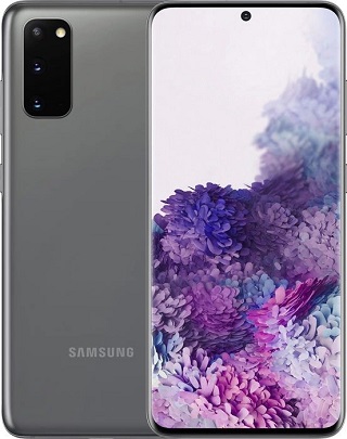
The latest version of the skin — One UI 3.0 — was released alongside Android 11 for the Galaxy S20 series first, back in December.
As expected, it brings several new features and tweaks to the UI, some of which are for the better, while a few other decisions are questionable.
Take for example the decision to remove the option to hide the camera cutout from One UI 3.0. There’s almost no logical reason for Samsung to remove it, but yet it did.
Now, users have also noticed another change in the UI that probably should have been left alone. As the saying goes — don’t fix what’s not broken.
Samsung has ditched the 4×4 grid size for folders in One UI 3.0 in favor of a 3×4 grid. Meaning, users can only see 12 apps per page in the folder instead of 16 apps. And well, this change does not sit well for some.
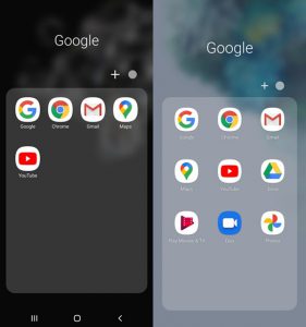
(Source)
We’ve shared some reports from users who dislike the change below:
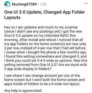
Same, I don’t like it, can’t seem to find where to change it. (Source)
Please let us change icon layouts or icon sizes for folders. OneUI 2 and 2.5 had 4 icons across, and it was a vertical free-scroll. OneUI 3.0 is now 3 icons across, wasted space, icons too big, and a horizontal page scroll. (Source)
Completely agree. Those large icons make the screen ugly n force us to use 3rd party launchers (Source)
Of course, this slight tweak Samsung made in One UI 3.0 does not hamper the usability, however, those who are accustomed to seeing a 4×4 grid in folders want a way to revert back to the previous setting.
Unfortunately, Samsung does not provide the option to tweak the grid size in the home screen launcher by default. This means there’s currently no way to get around the 3×4 grid in folders on the default launcher.
However, if the grid size is really bothering you, the next best option is to switch to a third-party launcher that offers the option to customize the grid size in folders and the home screen.
There are some excellent launchers available on the Google Play Store, however, Nova Launcher is an easy recommendation since it allows you to customize just about every aspect of the system.
But in case you aren’t willing to switch to a third-party launcher, there’s still some good news. The Home Up Good Lock module lets users change the grid size in folders and other aspects of the default launcher.
The only caveat here is that most Good Lock modules are yet to be updated with support for Android 11 (One UI 3.0). Earlier, we reported that Good Lock will bag support for One UI 3.0 this month.
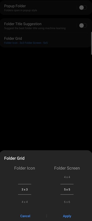
Therefore, Samsung users may not have to wait that long before they can revert back to using the 4×4 grid in folders on One UI 3.0.
Having said that, we will post an update once the Home Up module for Good Lock bags support for Android 11 or in the off-chance that Samsung provides users the option to tweak the grid size in future One UI 3.X versions.
In the meantime, check out our dedicated tracker to know more about the status of One UI 3.0 for all eligible phones from Samsung.
Update 1 (January 29)
01:53 pm (IST): Samsung has finally updated its Home Up Good Lock module with support for One UI 3.0. Simply download the Good Lock app via the Galaxy Store on your device and install the Home Up module to customize the folder grid size on your Samsung device.
Thank you for waiting Good Lock for One UI 3 (Android 11).
Good Lock is wearing a new style.
We hope you love this. 🙂
Update 2 (February 24)
11:52 am (IST): It seems Samsung realized its mistake and has finally added option to customize the folder grid size. Users will have to install the latest One UI Home application to get the folder grid size customization option according to a new report.
There are two options available for users to choose from — 3×4 and 4×4. The former is fine for those who wish to see larger icons while the latter is perfect for those who wish to see more apps per page in the folder.
PiunikaWeb started as purely an investigative tech journalism website with main focus on ‘breaking’ or ‘exclusive’ news. In no time, our stories got picked up by the likes of Forbes, Foxnews, Gizmodo, TechCrunch, Engadget, The Verge, Macrumors, and many others. Want to know more about us? Head here.

![[Update: Re-added] Samsung One UI 3.0 (Android 11) update ditches 4x4 grid in folders for 3x4 grid & users aren't happy [Update: Re-added] Samsung One UI 3.0 (Android 11) update ditches 4x4 grid in folders for 3x4 grid & users aren't happy](https://stage.onepluscorner.com/wp-content/uploads/2020/12/Samsung-One-UI-3.0-Galaxy-A-Series.jpg)
