Does the new Google Play Store UI redesign make it easier to manage apps and updates?
— PiunikaWeb (@PiunikaWeb) June 18, 2021
Vote below and read our opinion here: https://t.co/wIKZ3kAZFk
New updates are being added at the bottom of this story…
Original story (published on June 18, 2021) follows:
The Android ecosystem has evolved to another level over the time and Google is still working hard to make it even better.
However, it seems that the tech giant might be at a point where it is unable to decide what qualifies for good user experience or what does not.

The recent Google Play Store UI overhauls are testament to that as they have been getting mixed reactions from users.
To recall, Google changed the Play Store user interface earlier this year by getting rid of the hamburger menu in the top left. The items in that menu were shifted to the account switcher in the top right corner.
While this might have been done for ease of access, the UI change was not very well received as people had gotten used to the hamburger menu.
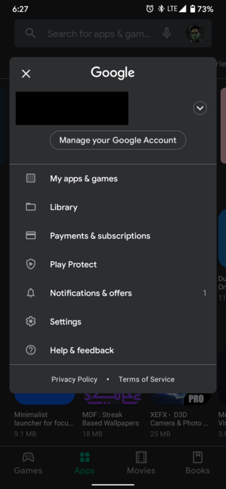
Now, the tech giant is now rolling out the redesigned Google Play Store UI update widely.
There is a Manage apps & device section in the account switcher in the top left corner which further has the Overview and Manage sections.
It is unclear what pushed Google to make this change but some users are not liking it one bit. This is because the new UI redesign has increased the number of steps to update apps.
I really hate the Play store redesign and rarely visit it. Liked it much better when my info and apps etc. were accessible from upper left hand corner. Going in from the right side just is weird. Google seems to make things worse for the Play Store I might have to switch to Apple after being an Android user since first Android smartphones came.
Source
I have a crazy habit of manually updating apps also. I agree the additional steps to hide away the apps are annoying. I don’t want extras steps/clicks to get to that page. Google whyyy
Source
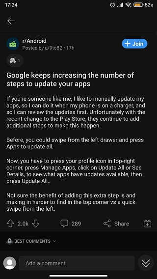
Users have to go through a lot of sections to finally reach the page which shows the Update all option where they can either update all apps or select the ones they want to update.
This is particularly affecting those who have not enabled the Auto-update apps setting in the Play Store.
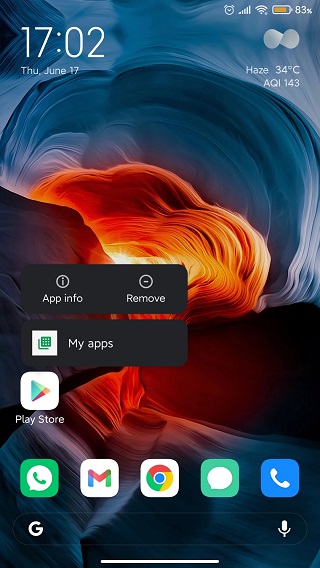
On the other hand, some users are even arguing that using the My apps shortcut by long-pressing the Play Store icon reduces the number of steps.
Depending on the phone you have, you can just long press on the Play store app icon and choose the sub-menu “my apps” then you’ll be in the “my apps” Play store page.
Source
That does work, even with the new update. I just tried it and it brought me to the redesigned page. From there I can tap “Update all” and it’ll work just like it did before.
Source
Since the said UI redesign appears to be garnering mixed reactions, Google should perhaps take the feedback into consideration before making any further changes.
That said, do you find the redesigned Google Play Store UI simpler or complicated? Feel free to let us know your opinion either by dropping a comment or by casting a vote on the Twitter poll given below.
As always, we will be back with the poll results by next week.
Update 1 (June 25)
IST 07:07 pm: The results are out and it seems 76.2% users want the old hamburger menu back whereas 14.3% users feel the new UI design is easier for managing apps and updates. Also, 9.5% users do not care about the new or old Play Store UI.
PiunikaWeb started as purely an investigative tech journalism website with main focus on ‘breaking’ or ‘exclusive’ news. In no time, our stories got picked up by the likes of Forbes, Foxnews, Gizmodo, TechCrunch, Engadget, The Verge, Macrumors, and many others. Want to know more about us? Head here.

![[Poll results out] Do you like the redesigned Google Play Store UI update? [Poll results out] Do you like the redesigned Google Play Store UI update?](https://stage.onepluscorner.com/wp-content/uploads/2021/03/google-play-store-fi.png)
