Here’s the crux of the article in video form:
New updates are being added at the bottom of this story…….
Original story (published on October 3, 2022) follows:
Spotify recently changed the Home page design on the Android and iOS app that allows users to expand into their recommendations.
The new Home screen of Spotify’s mobile app now has two sections namely ‘Music’ and ‘Podcast & Shows’. The update also adds new buttons to quickly share, like, and play music.
But it seems that a large chunk of users is not quite impressed with the new features and design changes brought to the Home page.
New Spotify Home page UI
Many Android users (1,2,3,4,5,6,7,8,9,10) are quite disheartened because of the recent changes introduced to the Home page of the Spotify app.
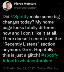
@SpotifyCares put the homepage back to what it was I can’t even find new music anymore this is atrocious
Source
Hey @SpotifyCares @Spotify where the hell have my daily mixes & just back in gone. What you’ve stuck on the home page is utterly useless.
Source
@Spotify this new home page layout is some of the worst user interface I have ever seen. Y’all gotta change that back ASAP
Source
It seems that the new Home page no longer includes sections like Daily Mixes, Recently played, Trending now, and Popular artists. There are only big icons showing random playlists that take up most of the space.
The new Home page UI also requires users to manually switch to ‘Shuffle’ after every single playlist.
Some Spotify users are even forced to revert to an older version as they feel restricted by the giant album cover while browsing music.

There are also several reports on the Spotify community forum that show users’ frustration with the new Home page design.
The new ui is terrible. It’s difficult to navigate and has a lot of wasted space. I trust you didn’t spend a lot of time on it because it looks like a beginner developer did it in 10 minutes. Bring back the previous.
Source
Unfortunately, the updated UI is terrible. The home page is completely useless. As an Android user, I think that a much better option would be to directly open to our library; so, if we choose never to look at that horrible home page, it would be our choice. Very disappointed in Spotify.
Source
Spotify’s response
Unfortunately, Spotify hasn’t properly acknowledged the issue yet and has only asked displeased users to reinstall the app or restart their devices.
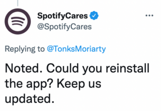
There’s also no workaround that can help resolve this matter for Spotify users temporarily.
We hope that the Android and iOS users facing issues with the new Spotify Home page UI get some respite soon.
We’ll keep tabs on further developments and update this article as and when something noteworthy comes up.
Update 1 (November 16, 2022)
05:11 pm (IST): Although many users disagreed with many of the new Spotify Home page UI changes, a new update has extended them to the majority, so it seems definitive (1, 2, 3, 4).
Update 2 (February 24, 2023)
10:19 am (IST): Spotify support has now responded to the complaints regarding new Home Page UI and said that they are currently testing possible improvements for it.
Hey! Thanks for sharing your thoughts about the new Home tab layout. We’re testing possible improvements, so you or someone else may see something new or get a limited feature temporarily on the app. We’ll be sure to pass on your comments to the teams working backstage. (Source)
Update 3 (February 28, 2023)
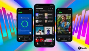
04:37 pm (IST): Spotify is reportedly set to launch TikTok-inspired UI next month. It’s a vertically swiped homepage created with the goal of enhancing discovery and luring a younger audience.
Update 4 (March 9, 2023)
09:10 am (IST): Spotify’s new TikTok-inspired UI is now rolling out to users. Now if you tap on ‘Music’ or ‘Podcasts & Shows’, it will take you to a vertically scrolling feed similar to TikTok.
Update 5 (March 10, 2023)
05:21 pm (IST): The changes in Spotify UI are gaining criticism to an extent where multiple users are recommending migrating to Apple Music, stating that it offers better UI and sound quality (1, 2, 3, 4).
Update 6 (March 21, 2023)
05:28 pm (IST): According to some users (1, 2), the new TikTok-like UI makes it more difficult to discover music.
Apparently, the UI format where a single song takes up the entire screen while exploring may be suitable for video services, but not music.
There is a lot of wasted space where multiple other songs and podcasts can fit. In addition, users are forced to do much more scrolling (1, 2).
Update 7 (March 22, 2023)
05:46 pm (IST): Some users (1,2) are requesting a switch that would enable switching between the ‘TikTok’ UI and old mode if it isn’t feasible to fully restore to the current UI.
Update 8 (March 23, 2023)
06:30 pm (IST): Android smartphone users can try downgrading to an older app version and disable the auto-update option.
Update 9 (March 24, 2023)
05:45 pm (IST): A report suggests that the app is automatically playing the next recommended song if the user scrolls down while listening to a song on the home screen.
Update 10 (April 05, 2023)
12:59 pm (IST): Spotify recently overhauled its desktop UI and several users are heavily criticizing it (1,2,3,4,5,6,7,8). Users are now asking the devs to revert this change.
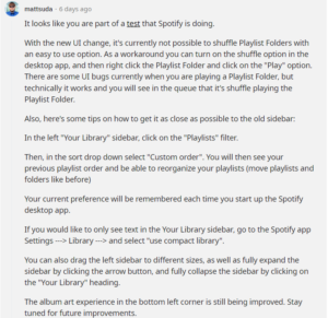
Moreover, the new update has also broken the ‘Shuffle Playlist’ folders option. According to a user, it seems that the team is currently testing the new desktop UI.
Also, they offer a fix for the faulty “Shuffle” feature along with the instructions for going back to the previous interface. You can check it out below:
Note: We have more such stories in our dedicated Spotify section so be sure to follow them as well.
Featured image source: Spotify
PiunikaWeb started as purely an investigative tech journalism website with main focus on ‘breaking’ or ‘exclusive’ news. In no time, our stories got picked up by the likes of Forbes, Foxnews, Gizmodo, TechCrunch, Engadget, The Verge, Macrumors, and many others. Want to know more about us? Head here.
![[Update: Desktop too] New Spotify Home page UI on Android & iOS faces backlash from users [Update: Desktop too] New Spotify Home page UI on Android & iOS faces backlash from users](https://stage.onepluscorner.com/wp-content/uploads/2022/10/Untitled-design-17-1.jpg)
