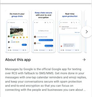
Ever since its inception in 2014, Google Messages has come a long way in terms of the expansion of its feature set and increase in popularity.
It is used by millions of people worldwide to exchange text messages, audio and video files, high-resolution images, and much more.
Last year, Google released a new notification icon which has now started showing up to more users. But some are quite unhappy with the new icon.
New Google Messages ‘notification icon’ not liked by many
According to reports (1,2,3,4,5,6,7,8,9,10) some are disappointed with the newly introduced notification icon in the Google Messages app. They feel that the previous icon design was way better than the one now.
For some, this change has been made by a recently released application update. Also, the new notification icon now matches the app icon, which has added to the user’s confusion.

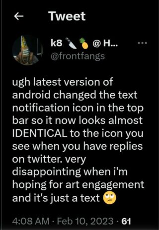
A Twitter user complains that the latest version of Android has changed the text notification icon in the top bar, which is identical to the one you see for Twitter replies.
They find it quite confusing to differentiate between the two with a single glance. One needs to look closer in order to see the double bubble overlap.

Another user alleges that the app no longer accurately displays multiple messages in the notification area. The newly introduced icon gives the impression that there are multiple messages when there is only one.
Some confuse the new notification icon for Signal or Bumble app’s one as it pops up like a talk bubble.

WHY did Google messages have to change the notification icon to be almost identical to the Twitter DM notification icon?
Source
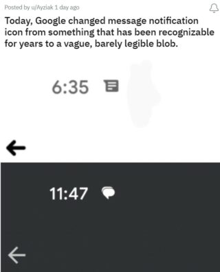
Today, Google changed message notification icon from something that has been recognizable for years to a vague, barely legible blob.
Source
Even tech reviewer Gaylon’s Gadgets thinks the app’s new notification icon is terrible. Some are so annoyed and frustrated that they are thinking of switching to alternative apps if Google does not bring back the old icon.
Unfortunately, as of now, there’s no method by which this can be rolled back or changed to the old one. It may take some time for the app’s users to get used to the recently introduced changes.
That said, we’ll keep an eye on the issue where some users are unhappy with the newly introduced Google Messages notification icon and update this article as we come across any new information.
Note: We have more such stories in our dedicated Google section so be sure to follow them as well.
Featured image source: Google Messages.
PiunikaWeb started as purely an investigative tech journalism website with main focus on ‘breaking’ or ‘exclusive’ news. In no time, our stories got picked up by the likes of Forbes, Foxnews, Gizmodo, TechCrunch, Engadget, The Verge, Macrumors, and many others. Want to know more about us? Head here.

