Poll time:
— PiunikaWeb (@PiunikaWeb) March 4, 2021
Do you like the new MIUI 12 Control Center or prefer the old notification panel?#MIUI #MIUI12 #Xiaomi #feature #MIUI #poll
Vote below and read our coverage here: https://t.co/VcYNSrsgMO
New updates are being added at the bottom of this story…
Original story (published on March 04, 2021) follows:
MIUI 12 was launched back in April 2020 with a plethora of new features, many that were endemic to Xiaomi. A couple of such are the unique Super Wallpapers and some really advanced privacy features.
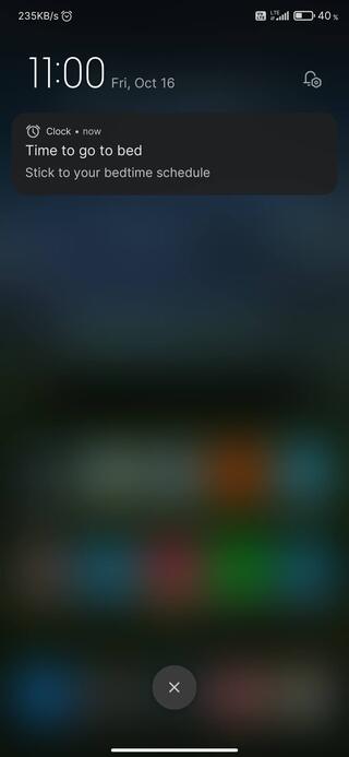
But perhaps the greatest highlight was a completely re-designed notifications panel which looked pretty radical by Android standards. After all, it was a total rip-off from the control center found on iOS.
Historically, Android has always kept notifications and quick toggles combined, unlike iOS that likes to keep both things separate. Of course, there are a set of advantages and disadvantages to both, which we will delve into here.
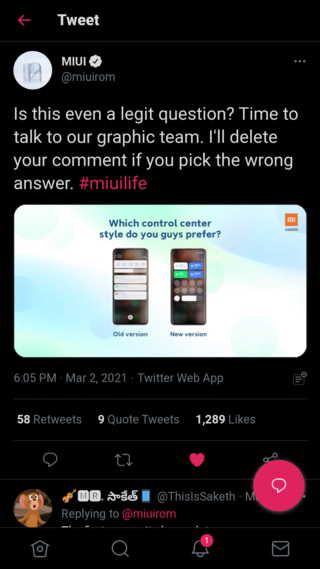
This little initiative was inspired by a recent tweet by Xiaomi which seemed to imply that a choice between the new MIUI 12 control center and the old notifications panel is a no-brainer.

However, quite surprisingly, users had pretty different views. Many chose the utility offered by the classic notification panel over the fanciness of the new control center. The points put forward by them have been discussed below.
For starters, the biggest benefit of a combined quick toggles and notifications panel is that both can be very conveniently accessed by a single swipe from the status bar atop.
On the other hand, the control center is a wee bit confusing. To bring down the quick settings, one has to swipe down from the right of the status bar. And to access all the notifications, it has to be from the left.
Now, MIUI 12.5 is slated to make things a tad easier by allowing users to switch directly between the notifications and quick toggles section, but it is still a far cry in terms of the convenience offered when both are merged.
From this, it can be established that the old notification panel is overall more convenient.
Or is it? A combined notifications and quick toggles area means that one will have to constantly keep swiping away notifications upon accessing the quick settings to keep things a bit tidy.
After all, users with hundreds of apps on their phones will agree that they’re bombarded with notifications every minute, which if unchecked, can result in quite a mess sometimes.

Thus, in such a case, many would prefer to distance their notifications from the quick toggles – something the new control center on MIUI 12 fulfills well.
Not only that, but it also looks more pleasing overall with its colorful animated icons and far more modern aesthetics. This is just an opinion though as there are plenty that will feel otherwise.
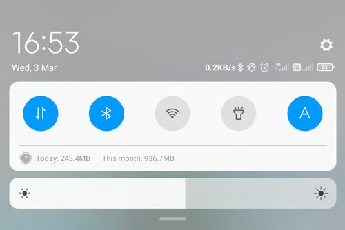
Last but not the least, there’s the case of missing data usage info. The old notification center used to have a dedicated section to display the used and remaining data, something that’s missing from the control center.

Many users take their data usage seriously and this little feature lacking didn’t go down too well with them. Some have even said they chose to stick to the old notifications layout solely because of this.
Still, it’s pretty great to see how considerate Xiaomi has been with regards to user sentiments. They could’ve quite easily done away with the old implementation completely by incorporating the new one as a replacement.
Instead, they chose to add an option to toggle between the two.
That said, we can of course blabber on and on about the boons and banes of either of the two interfaces. But ultimately, it all comes down to you — the users — to decide which emerges as the true winner.
Hence, we are conducting a poll for the same. You can either drop a comment in the section at the end of this article, cast your vote on the Twitter poll below, or do both, as per your convenience.
As always, the poll results will be out by next week.
Update 1 (March 12)
05:00 pm (IST): A fourth of the total users (24.3%) still preferred the old notification over the new Control Center while a majority (75.7%) were found to be in favor of the latter. From this, it can be concluded that Xiaomi is heading in the right direction which is great!
PiunikaWeb started purely as an investigative tech journalism website with a main focus on ‘breaking’ or ‘exclusive’ news. In no time, our stories got picked up by the likes of Forbes, Fox News, Gizmodo, TechCrunch, Engadget, The Verge, MacRumors, and many others. Want to know more about us? Head here.

![[Poll results out] Many MIUI 12 users still prefer the older notification panel over the new control center, what about you? [Poll results out] Many MIUI 12 users still prefer the older notification panel over the new control center, what about you?](https://stage.onepluscorner.com/wp-content/uploads/2021/03/miui-12-control-center.jpg)
