Apple iPad is among the most used tablets across the globe and people use it for numerous purposes. On the other hand, Reddit is one of the most used apps on any platform.
The iPad app for web content rating, discussion, and social news aggregation platform recently got a new UI for video posts.

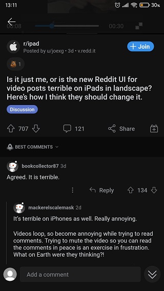
However, iPad users are not liking this new Reddit UI for video posts in landscape mode as it is making it hard for them to go through the comments while watching the video.
As per a rather long Reddit thread, iPad users are finding the said UI change terrible as the video in the Reddit post takes up most of the screen further blocking the comments section.
Also, swiping up to view the comments section hides the video completely. It is possible that this UI change might be so that users can go through the video in its entirety before heading over to the comments section. Not a very efficient approach.

This is still based on speculation as there is no official word on the matter but UI changes are usually done in order to improve the user experience.
However, the said UI change with the iPadOS Reddit app appears to be doing the opposite as users are finding it inconvenient.
This is what led the OP of the Reddit thread about the UI change to come up with a mockup of the app which appears to be more streamlined.

The mockup shows the video post UI in the Reddit app in a split view design where the screen is divided into two sections.
The section on the left shows individual posts with their details whereas the right section shows comments for a selected post. Both sections can be scrolled through individually.
Moreover, the selected post in the left section is highlighted and the other posts are greyed out which further makes it easier to grasp the overall flow.

While the mockup UI does appear to be user friendly, it is unclear whether Reddit will implement it or something similar to improve the user experience.
Hopefully, the UI becomes better in the future so that Apple iPad users can use the social news aggregation app without any hassle.
That said, we will report back with more details as and when new information becomes available so stay tuned.
PiunikaWeb started as purely an investigative tech journalism website with main focus on ‘breaking’ or ‘exclusive’ news. In no time, our stories got picked up by the likes of Forbes, Foxnews, Gizmodo, TechCrunch, Engadget, The Verge, Macrumors, and many others. Want to know more about us? Head here.


