New updates are being added at the bottom of this story…….
Original story (published on October 13, 2022) follows:
Duolingo is one of the most popular language learning services worldwide. It allows you to start learning and delve into dozens of languages through short lessons and daily challenges.
You can access the lessons both from the website and from the mobile app (Android and iOS). The progress in the lessons is normally represented through a UI that simulates a ‘tree’.

However, Duolingo is currently working on a new ‘Path UI’ which is being heavily criticized by many users who have already tried it.
The new controversial Duolingo app ‘Path UI’ update
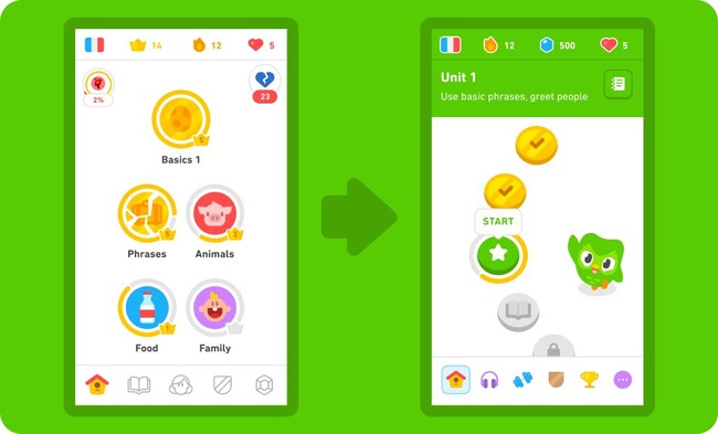
The traditional Duolingo ‘Tree UI’ is based on completing certain ‘lower’ challenges to climb up the tree, and the higher you climb the more complex challenges you will encounter until you reach the final lesson.
Instead, the new Path UI is simply a path where you must go ‘lesson to lesson’ linearly to progress. It also appears that you won’t be able to choose which of the ‘lower’ lessons to complete first.
You can clearly see the difference between both UI layouts in the following short video:
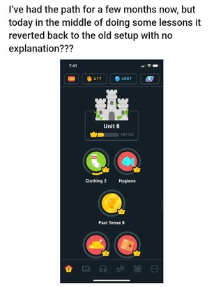
It seems that some users were already trying out the new Duolingo Path UI before its massive rollout. During the trial, the UI sometimes switches between the classic and the new one.

Annnddd it’s gone. Open the app 10 minutes later and it’s back to the path. Duo why are you fucking with me???
Source
Many users are against the new ‘Path UI’, they are losing motivation
It seems that a recent update to the Duolingo app (on both iOS and Android) expanded the ‘Path UI’ test, allowing many others to have a taste.
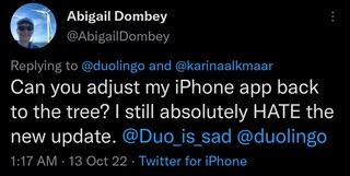
That said, the UI redesign is getting a lot of flak. Multiple reports indicate that there are many people who prefer to keep the classic Duolingo UI instead of the new Path UI.

I’ve decided to delete your now horrible app. This update is possibly the worst abomination to my eyes I have ever seen. It has ruined my passion for language. I have been making no progress since this update. It’s been including concepts I haven’t learned yet.
Source
Duo I almost have a 200 day streak, if y’all go through with this update I swear I’m gonna delete the app. Nobody wants it, just revert it back to the old way please. #duolingoupdate @duolingo
Source
There are users who are considering deleting their Duolingo accounts due to the UI redesign. As per reports, the changes are even hindering progress between lessons since some have lost the motivation to use the app.
One of the biggest problems with the redesign is the lack of ‘freedom’. Since you can no longer choose which lessons to do first, users are forced to follow the unique learning path that Duolingo lays out.

Also, it seems that the system of earned ‘crowns’ has disappeared. Even users won’t be able to make ‘Stories’ when they want, but when the path allows it.
Its a rubbish update. It forces you down a learning path that Duolingo says is best for you not one that the learner thinks is best for them. It has taken away progress (crowns gone) and it prevents you doing stories when you want.
Source
Duolingo app ‘Path UI’ mass rollout starts on November 1
The Duolingo team confirmed through an announcement on their blog that the new ‘Path UI’ will be coming to everyone on November 1.
The new Duolingo home screen experience will be launching November 1, 2022 for all learners. If you have questions about this change, read on for answers!
Source
There are still no official comments from the Duolingo team on all the criticism Path UI is receiving. We will update this story as events unfold.
Update 1 (November 17, 2022)
11:49 am (IST): One of our readers has pointed out that someone has started a petition demanding Duolingo reverse the new UI update.
Thanks for the tip: Myalisa L’Heureux!
Update 2 (November 22, 2022)
12:20 am (IST): It seems that the most recent Duolingo app update is bringing the classic ‘Tree UI’ to some users. It is not yet clear if this is a bug or something intentional.

Also, for those who want to bring back the old ‘Tree UI’, here is a workaround you can try:

Update 3 (December 16, 2022)
05:49 pm (IST): According to fresh reports (1, 2, 3, 4, 5, 6), the most recent app update on iOS is causing progress loss for some users.
PiunikaWeb started as purely an investigative tech journalism website with main focus on ‘breaking’ or ‘exclusive’ news. In no time, our stories got picked up by the likes of Forbes, Foxnews, Gizmodo, TechCrunch, Engadget, The Verge, Macrumors, and many others. Want to know more about us? Head here.
