Google has been working on adding tab groups to Chrome for Android for over a year now. The feature made scattered appearances for some users on the beta channel a while back before being finally rolled out for all in January.
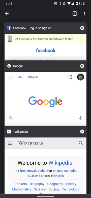
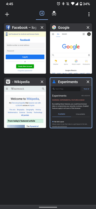
And following the fateful rollout, there has been quite an uproar in the Google Chrome community. Users have been demanding the return of the previous vertically stacked view ever since.
But why all the hate for the tab groups/grid-view? Well, firstly, users have complained about its aesthetics and that the older layout favored fast fingers while the newer one is too slow to use.
This is combined with the fact that the previews are much smaller now making pages from a single website appear identical. Also, the new UI truncates the title of the web page so much that it’s frequently useless.
Then there are the operability issues wherein the new tabs layout decreases the reachability of tabs since they’re now lined up top instead of being weighted to the center.
Not all is in the negative though since there is a pretty major perk brought along with the updated tabs interface that is worth all the sacrifice.
Users can now drag tabs and place them on top of each other to create groups. This is not too different from how apps on Android home screens can be placed on top of each other to create folders.
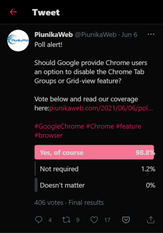
But as it turns out, the users have spoken for themselves. We previously held a poll asking users whether Google should provide Chrome users an option to disable the Chrome tab groups to which an overwhelming 98% voted yes.

Now, our poll definitely doesn’t represent a fair sample of the entire Chrome userbase but you still get the point.
Chrome previously did include an option to disable the new tab groups. This was in the form of a flag that allowed disabling the experimental feature that grouped tabs were.
However, after a period of testing, group tabs were deemed stable, were rolled out to all, and almost every flag associated with them was either rendered useless or removed.
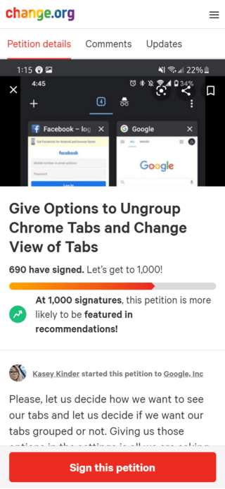
This has only further angered users who have now started not just one, but multiple Change.org petitions demanding the return of the vertically stacked card layout.

Remove Group Tabs From Google Chrome. It should be clear that the majority of people don’t want group tabs on chrome. It literally makes me nauseous to deal with. All I ever read about is people complaining about it or trying to figure out a workaround.
Source
Make Google Chrome Mobile Tab Groups Illegal Under International Law!
Source
While 1000+ signatures all in all do convey users’ dislike for the new tabs interface, they’re barely anything in the eyes of an MNC like Google with over a billion Chrome users under it.
From this, it’s easy to conclude that tab groups aren’t going away anytime soon and are here to say. It would therefore make more sense to pick up the shortcomings of tab groups’ current implementation and demand Google to address them.
But even without it, we are pretty sure that Google is indeed working behind the scenes, trying to make improvements to grouped tabs as we speak. After all, the feature is still in its infancy and needs more polish.
Thus, the finished product should hopefully be better than the vertical cascading tabs layout ever was. For now, try getting used to grouped tabs and let Google do its thing.
Note: To access all currently available workarounds to disable tab groups on Google Chrome, head here.
PiunikaWeb started purely as an investigative tech journalism website with a main focus on ‘breaking’ or ‘exclusive’ news. In no time, our stories got picked up by the likes of Forbes, Fox News, Gizmodo, TechCrunch, Engadget, The Verge, MacRumors, and many others. Want to know more about us? Head here.


