[POLL]
— PiunikaWeb (@PiunikaWeb) February 10, 2021
Do you like the new color-changing UI in Android 12? #Android #Android12 #update #AndroidOS #android12developerpreview #UI #poll #Opinion #OpinionPoll https://t.co/14Y9sXveoo
New updates are being added at the bottom of this story…….
Original story (published on February 10, 2021) follows:
Android has come a long way. And the result is that today, there are hardly any major UI changes and head-turning additions whenever a new Android OS update rolls out.
Take the latest Android 11, for instance. You’d be forgiven for terming it as a boring upgrade owing to the minimal differences when compared to Android 10.
But then again, Android 10 wasn’t massively different from the previous Android Pie, implying that indeed, Android as an OS has perhaps matured.
Going forward, we can only expect minimal UI changes and minor additions here and there. So we thought, at least some of us in the larger Android fraternity.
This has been the case only until recently when a bunch of images surfaced online thanks to the guys at XDA Developers. The images, apparently, are mockups of the upcoming Android 12 update.
If any or all of these images are to be trusted, well, it looks like Google has a massive UI redesign coming up in Android 12.
The images point to a new Sepia tone that is nowhere near the white color scheme on Android 11. But if the previous color-changing reports are anything to go by, users might be able to change this color scheme.
Here, it is alleged that Android 12 theme colors will auto-change based on the active wallpaper. This will also happen even after changing your wallpaper.
So, in the case of the Sepia tone seen in the images above, you will have Sepia-colored icons, widgets, notification panel, settings, and even the camera app. This applies to other color schemes as well.
Color schemes aside, the leaked images also point to a revamped notification panel with some visible rounded corners and new Quick Settings, including the icon shapes.
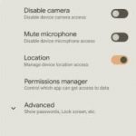
As is with every other Android upgrade, Google also seems to be focusing on privacy with the update to Android 12. The return of alerts when an app is using your location, camera or microphone perhaps is the big deal here.
Last but not least, the mockups also show off what Google calls a Conversation widget. With this, users will be able to see a combined private or group chats from multiple apps or calls from a contact in one go.
Of course, the things highlighted here are subject to change. But with Android 12 developer preview 1 expected to hit the ground anytime now, we should find out soon. You can keep an eye on that here.
Until then, we would like to hear your thoughts on the alleged changes that Google has baked into Android 12. Do you like them? Let us know in your comments below.
We also have a Twitter poll that you can cast your vote right away. The article will be updated after one week with the poll results.
Update (February 17)
As promised, we now have the poll results confirming that which we already expected — that most of you guys (73.1%) like the new color-changing Android 12 UI.
Some of those who voted (15.4%) are not so impressed with the new UI overhaul that Google is planning while the rest (11.5%) remain undecided.
PiunikaWeb started as purely an investigative tech journalism website with main focus on ‘breaking’ or ‘exclusive’ news. In no time, our stories got picked up by the likes of Forbes, Foxnews, Gizmodo, TechCrunch, Engadget, The Verge, Macrumors, and many others. Want to know more about us? Head here.


