Settings can now use the Material shared X-axis animation when moving between screens. pic.twitter.com/zdRUFQUrKi
— kdrag0n (@kdrag0n) June 9, 2021
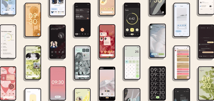
Google’s focus this year has been giving a complete visual overhaul to Android. While there are indeed plenty of feature additions and under the hood improvements, Android 12 is more of a UI refresh than anything else.
This is pretty clear when Google made use of terms like ‘Material You’ to highlight the aesthetics behind the latest version of their OS.
The last time Google updated its design language was with Android 9/10 when Material Design 2 came into existence. It’s been 3 years since then and a design refresh wasn’t only much-needed but was inevitable.
We have already covered almost all of the visual changes and new features introduced with Android 12 in our dedicated tracker for the same so be sure to go through it if interested.
And now that Android 12 Beta 2 is here, those enrolled in the program have been spotting new changes over the previous beta version. We have cherry-picked and highlighted some of these visual updates.
New Settings app animation
As you can see in the video below, the Settings app can now use the sophisticated Material shared X-axis animation when moving between screens.
But what exactly is a shared X-axis animation? Well, in simple terms, they’re transitions between distinct elements and are executed with a fade combined with transition in a given direction.
In the Settings app animation, the transition is horizontal. Hence, the ‘X’ axis name.
Do keep in mind that this is a hidden change and will probably not be enabled by default for all.
New YouTube app PiP animation
Android 12 introduced behavior improvements and new features for the picture-in-picture (PiP) mode. This included a rounder window and new gestures and controls.
Among them is a new API for a smoother transition to the PiP mode when using gesture navigation. It appears that YouTube is now making use of this new API flag with the latest beta update.
Yep, as you can see in the above demo, using the swipe-up gesture to make YouTube switch into the PiP mode results in a really smooth and slick transition.
Of course, installing the same beta on Android 11 to try out the new gesture animation will be fruitless since the OS version doesn’t have the required API.
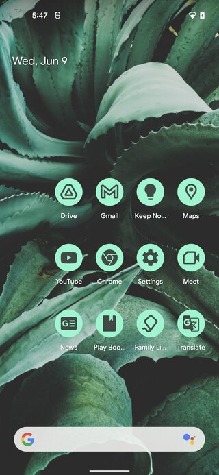
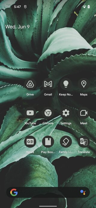
Android 12 Beta 2 finally gets Material You icon color support
The app icons on Android 12 Beta 2 can finally be themed as per the wallpaper colors. This once again is a hidden feature so it may not be available for all.
Obviously, for an app’s icon to be theme-able in Material You colors, the developer would have to add support for it. Thus, as of now, only the following Google apps are theme-able:
Note: We have more of such stories in our Android 12 section.
PiunikaWeb started purely as an investigative tech journalism website with a main focus on ‘breaking’ or ‘exclusive’ news. In no time, our stories got picked up by the likes of Forbes, Fox News, Gizmodo, TechCrunch, Engadget, The Verge, MacRumors, and many others. Want to know more about us? Head here.

