New updates are being added at the bottom of this story…….
Original story (published on January 26, 2023) follows:
Lately, Spotify developers seem to be actively looking for a new design to refresh their image. However, these types of changes are not always welcome.
When millions of users have been used to something for years, relatively drastic changes can cause a backlash. The app Home page UI redesign on Android and iOS app is an example of this.

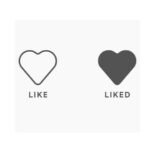
Now, the Spotify team is back with a new change, replacing the ‘heart button’ for a ‘plus sign’ to add items to ‘Your Library’ and playlists.
And, as expected, the change is bringing opinions both for and against.
Spotify ‘plus sign’ instead of the ‘heart button’; in favor or against?
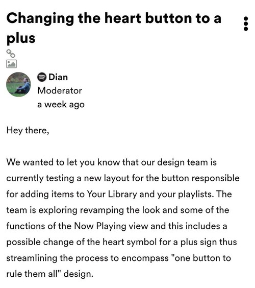
Spotify team confirmed through their support forums the redesign in the ‘heart button’. They say they are ‘revamping the look’ of the app.

The change in question has not yet been deployed en masse. However, it is already being tested on the accounts of some users, who are offering their reactions.
Starting with the reactions against the redesign, they seem to be quite a lot. This is something to expect when there is usually a change to something that has been around for a long time.
Currently, there are users asking how they can revert the new button design. Some even call the change ‘atrocious’.

Heart button replaced by plus sign
How come i can no longer put a heart on a song and instead a plus sign is there? Is there a way to change this?
Source
As y’all might know, Spotify has been A/B testing an absolutely atrocious new design for the NowPlaying UI. PLS upvote this comment on the Spotify community so that they at least consider fixing this mess
Source
It’s worth pointing out that the reasons for users to reject the change are not just aesthetic. Apparently, the redesign also brought a functional change.
The change in question causes users to no longer be able to easily see which songs were given a heart in some playlists.
The thing that i dislike the most is that i can’t see I’ve “hearted” in various lists. (Now it’s a plus sign elsewhere too.)
Source
Some users try to find the positive of the new button
There are also comments that are not so negative about the change. While there doesn’t seem to be a lot of reactions that are totally in favor of it, there are users who are looking to see the positive in the new UI.
Some point out that negative reactions usually come with every design change, but in the end users get used to it. In addition, the Spotify ‘plus sign’ brings another functional change, but now in favor of practicality.

Currently, the ‘heart button’ allows you to add songs to a playlist at once. But, the new ‘plus sign’ allows you to add the song to multiple playlists at the same time, which speeds up the process.
this just happened to me too. i’m really disappointed because i also liked looking at playlists or albums and seeing which songs i already had liked. on the positive side though, with this same update, i now have the ability to add a song to more than one playlist at a time.
Source
Same here. It’s turned into a little plus sign in a circle. I’m trying to figure out how I feel about it, ha. It’s more convenient to add to playlists (fewer clicks) but I do miss the heart and being able to see liked songs on a playlist easily.
Source
Even so, these users feel that they will miss the classic heart.
So, having opinions on both sides, what’s your take? Should Spotify keep the plus sign (instead of heart button), or keep the classic? Feel free to vote in the poll and leave your comments below.
Sorry, there are no polls available at the moment.Update 1 (Feb. 28, 2023)
03:40 pm (IST): Spotify has now started rolling out the ‘plus button’ globally, which was earlier limited to a handful of users.
Update 2 (Mar. 10, 2023)
06:02 pm (IST): Some users agree (1, 2) that the ‘Plus’ button is more convenient for quickly adding songs to multiple playlists.
However, some also say (1, 2) that they need a visual indicator that a song has already been liked or added to the playlist before browsing the playlist or artist profile.
Update 3 (Mar. 21, 2023)
05:35 pm (IST): Some users are not happy (1, 2, 3, 4, 5, 6, 7) with the new ‘+’ icon for adding the songs to library. Instead, they want the heart icon back as it feels more aesthetic and appealing.
In response, Spotify support has escalated the request to the appropriate team.
Hey there! We can’t promise that the heart will be back, but we’ll let the right team know it’s something you want to see again. For anything else, just give us a shout. (Source)
PiunikaWeb started as purely an investigative tech journalism website with main focus on ‘breaking’ or ‘exclusive’ news. In no time, our stories got picked up by the likes of Forbes, Foxnews, Gizmodo, TechCrunch, Engadget, The Verge, Macrumors, and many others. Want to know more about us? Head here.
![[Updated] Poll: Should Spotify keep the plus sign (instead of heart button) when adding items to Your Library & playlists? [Updated] Poll: Should Spotify keep the plus sign (instead of heart button) when adding items to Your Library & playlists?](https://stage.onepluscorner.com/wp-content/uploads/2022/12/Spotify-featured-1.jpg)
