Firefox, Mozilla’s popular browser, recently received an update with performance fixes and some additions. However, it seems that it also brought some unexpected issues.
This is not the first time that a Firefox update arrives with some bugs. In the past we have covered the broken ‘recommended URL autocomplete‘ on mobile devices, the crashing issue after v103 update, among others.
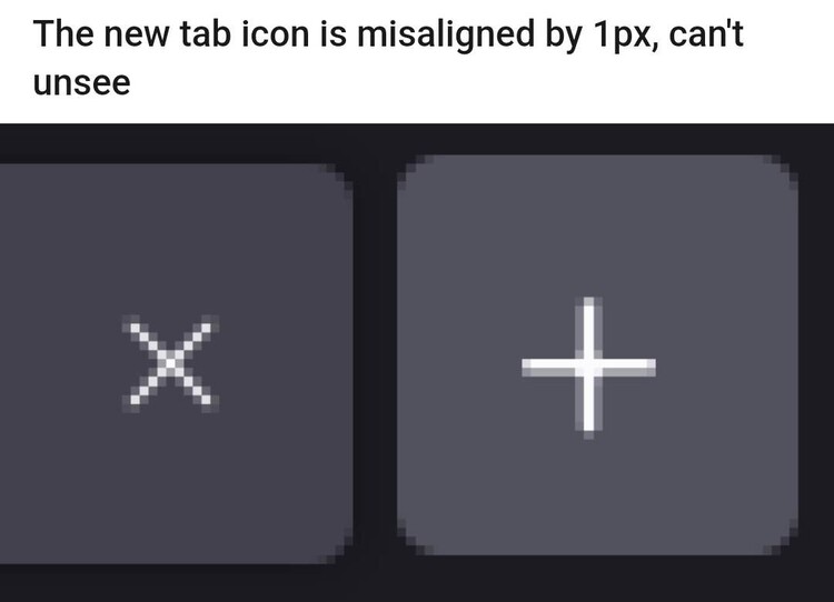
Now, Firefox v108 update is preventing some users from seeing the tabs in the ‘tab bar’. Also, there is a slight mismatch in the ‘New Tab’ icon design which can be visually awkward for the very observant folks.
Firefox v108 update ‘missing tabs in tab bar’ and ‘misaligned New Tab icon’
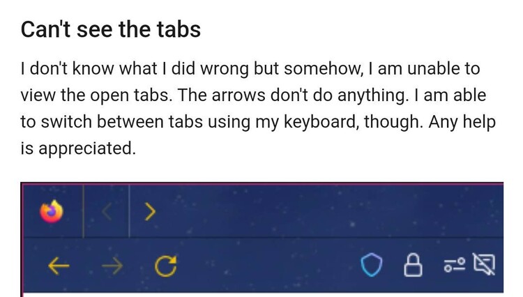
According to multiple reports, the Firefox tabs in the ‘tab bar’ are completely missing or hidden for some users after the v108 update (1, 2, 3, 4, 5, 6, 7).
The bug also makes the small arrows that are often used to switch between groups of tabs when there are many open useless. The arrows keep appearing, but they no longer do anything.

Tabs completely disappeared from the tab bar
I closed firefox for a few minutes so that I could render a video in DaVinci without hindering my computer useless for a few mins due to CPU spikes. Upon opening firefox again, all tabs that were opening were completely invisible
Source
New ff update 108, new issues with tab bar.
A usual, new update, new issues with customizing FF. After updating FF to 108, tab bar settings doesnt work anymore in my userchrome.css. How do i adjust tab bar and tab height in this version of Firefox?
Source
Apparently, everything is due to a conflict of the update with the userChrome.css. For those of you who don’t know, userChrome.css basically allows you to customize the look and feel of your browser using CSS.
The update reportedly brought another issue, although a little less serious. Now, the ‘Plus’ symbol in the ‘New Tab’ icon is no longer fully centered, plus the icon is slightly misaligned (moved up).

A couple of workarounds to get your tabs back
Pending official acknowledgment, there are a couple of workarounds for the bug that breaks your userChrome.css. First, you can try the following:
If you just want to return to defaults, you can open about:config and set toolkit.legacyUserProfileCustomizations.stylesheets to false.
Source
Alternatively, you can delete the code line below from your userChrome.css:
I have a pretty heavily modified userChrome.css and removing the below line fixed the issue. So far, there don’t seem to be any additional unforeseen consequences of this:
#tabbrowser-arrowscrollbox { position: absolute; }
Source
Unfortunately, there is no workaround yet to help fix the inconsistency in the design of the ‘New Tab’ icon. We will update this story as new relevant developments emerge.
PiunikaWeb started as purely an investigative tech journalism website with main focus on ‘breaking’ or ‘exclusive’ news. In no time, our stories got picked up by the likes of Forbes, Foxnews, Gizmodo, TechCrunch, Engadget, The Verge, Macrumors, and many others. Want to know more about us? Head here.

