[Poll] Do you like the new redesigned 'System Settings' on macOS 13 Ventura?
— PiunikaWeb (@PiunikaWeb) October 31, 2022
Vote below & read our story on it here:https://t.co/mAHirervrd
New updates are being added at the bottom of this story…….
Original story (published on Oct 31, 2022) follows:
macOS 13 Ventura is the latest iteration of Apple’s infamous desktop operating system. Unlike the previous few versions, this one brings some major changes to the look and feel of the user interface.
Whenever a big UI change is made to a platform or service, it’s pretty normal to expect some backlash, genuinely useful feedback and a plethora of threads/posts on social media.
This is exactly what’s been happening in the case of macOS 13 Ventura, especially with the redesigned ‘System Settings’.
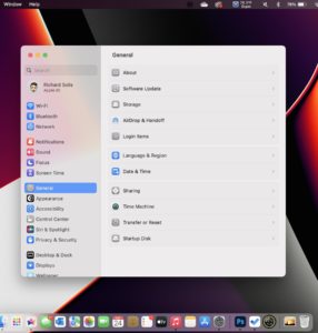
The new ‘System Settings’ design
The new macOS 13 Ventura ‘System Settings’ received a major makeover with the recent update. However, the change has received a mixed response from users.

The ‘System Settings’ have been completely redesigned to look more like the Settings page you’d find on your iPhone or iPad. Honestly, I can already see why this change is so controversial.
The fact that desktop operating systems are trying to be more and more like mobile operating systems has been a huge point of discussion lately. Windows 11 received some heat for its ‘mobile-like’ widgets as well.
I can imagine why the new ‘System Settings’ interface could turn off Mac users who’ve grown accustomed to the more ‘PC-like’ settings from previous versions.
Some are displeased by the new change and have taken to social media platforms like Reddit to express their frustration.
Several early adopters of macOS 13 are also disappointed to find that ‘System Settings’ are still unreliable and unresponsive despite the major design changes.
The app is so unresponsive and there’s a constant delay when opening & switching between sections and submenus. Not to mention that the whole app just looks and feels like a cheap knockoff of an iOS/iPadOS app…
Source
A Redditor has highlighted how the new user interface introduces a slight delay while switching between categories of settings.
It appears that many are annoyed by the fact that Apple put more focus on the design aspect of the settings instead of actually fixing the deep-rooted issues.
Weird choices like adding the ‘Default Web Browser’ option under the ‘Desktop & Dock’ tab further add to the list of dividing items in the new design.
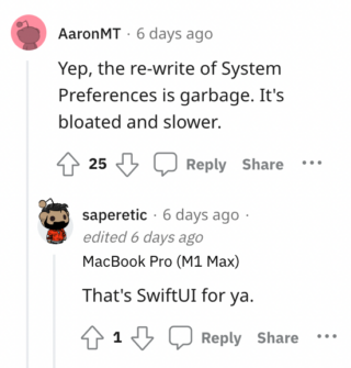
According to users, the new System Preferences app is bloated, slow and plagued with performance issues. Many are blaming SwiftUI for the same.

Making matters worse, some are experiencing an issue where the ‘Schedule’ feature is completely missing in the new UI. But the actual functionality appears to be working fine regardless.
While I understand the perspective of hardcore Mac enthusiasts, I can see why companies are making such changes to their UIs. ‘Mobile-style’ designs are more friendly, inviting and easier to learn for the average user.
The new ‘System Settings’ may not be perfect, but I honestly believe that they look much less intimidating, are easier to navigate and bring more consistency to the Apple ecosystem.
And luckily, I am not the only one that has the same opinion. Many others are genuinely liking the new design and are open to learning and experimenting with it going forward.
Just upgraded to MacOS Ventura and I am grateful that @Apple has FINALLY changed the layout of System Preferences. This is so much better
Source
That said, we’d like to know your thoughts about the redesigned ‘System Settings’ in the comments section as well as the poll below, whose results will be updated after a week.
Update 1 (November 7, 2022)
01:40 pm (IST): Poll results are out and while the majority (85%) of our readers do not like the new system settings on macOS Ventura, 10% say they do. The rest 5% don’t really care about it.
Note: You can also check out our dedicated macOS 13 Ventura updates and bugs/issues tracker.
PiunikaWeb started as purely an investigative tech journalism website with main focus on ‘breaking’ or ‘exclusive’ news. In no time, our stories got picked up by the likes of Forbes, Foxnews, Gizmodo, TechCrunch, Engadget, The Verge, Macrumors, and many others. Want to know more about us? Head here.
![[Poll results live] macOS 13 Ventura new 'System Settings' dividing opinion among users: do you like it? [Poll results live] macOS 13 Ventura new 'System Settings' dividing opinion among users: do you like it?](https://stage.onepluscorner.com/wp-content/uploads/2022/10/macOS-13-Ventura-1.jpg)
