New updates are being added at the bottom of this story…
Original story (published on July 02, 2021) follows:
Apple is busy preparing updates for its operating system lineup. Among them, the iPadOS 15 update for which the first beta came out pretty recently.
While the stable iPadOS 15 update release is still far, its new home screen and Safari changes are already garnering some negative feedback.

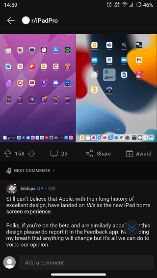
As per multiple threads on Reddit, it seems Apple iPad users are not quite fond of the home screen layout of the upcoming iPadOS version.
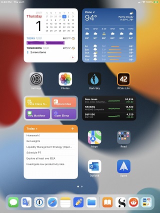
Users are particularly not liking the wide spacing and centering of apps and widgets on the home screen.
Also, the app grid layout only allows a total of five rows for apps and widgets whereas only four columns for apps in the portrait mode.
This layout with only 4 columns of icons looks like such a huge step backwards. I love using my iPads so much since 2014 but I’m getting desperate with Apple and their vision for iPad.Source

This is spoiling the user experience for many as there are no options to customize the layout to occupy all the extra space which is being wasted.
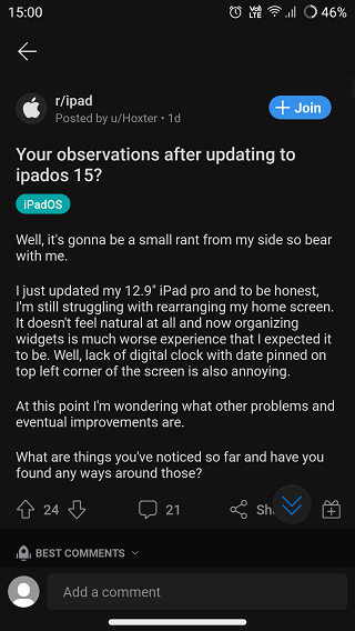
Apart from that, users are also pointing out that the digital clock which used to be pinned to the top left corner is missing on the upcoming iPadOS version.
iPadOS 15 Observation: We have lost the ability to have the Time and Date cleanly pinned to the top left of the Home Screen…
Source
All in all, the home screen UI changes that the said update has to offer so far are certainly not pleasing iPad users.

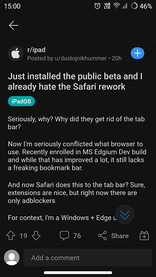
On the other hand, some users are finding the new hidden tab bar/menu layout in Safari annoying as they are unable to properly control the web browser because of the said change.
Since web browsers for iOS and iPadOS use the WebKit engine, the said change appears to be present across the likes of Microsoft Edge as well which is missing the bookmarks bar.
While every major OS update usually focuses on enhancing the user experience, Apple’s iPadOS and iOS 15 updates appear to be doing the opposite.

Hopefully, Apple takes a good look at the feedback from users and provides more clarity on the matter.
That said, we will keep tracking the development of the upcoming iOS and iPadOS versions and will report back with more details.
Update 1 (July 17)
IST 12:20 pm: It seems Apple has listened to users’ feedback regarding the changes made to the Safari browser as the macOS Monterey beta 3 update offers an improved experience with several controls added to the browser for ease-of-access. Also, users are liking the new changes in Safari.
PiunikaWeb started as purely an investigative tech journalism website with main focus on ‘breaking’ or ‘exclusive’ news. In no time, our stories got picked up by the likes of Forbes, Foxnews, Gizmodo, TechCrunch, Engadget, The Verge, Macrumors, and many others. Want to know more about us? Head here.

![[Update: Jul. 17] iPadOS 15 home screen & Safari changes already drawing some negative feedback [Update: Jul. 17] iPadOS 15 home screen & Safari changes already drawing some negative feedback](https://stage.onepluscorner.com/wp-content/uploads/2021/07/iPadOS-15-FI-new.jpg)
