Time for a #poll!
— PiunikaWeb (@PiunikaWeb) May 25, 2021
What are your thoughts on the new sparkle animation in Android 12 beta 1?
Vote below and read our coverage here: https://t.co/p06CWnh7zy#Android #Android12 #Android12beta #beta #update #updates #feature #OS #animation #smartphones
New updates are being added at the bottom of this story…….
Original story (published on May 25, 2021) follows:
Android 12 is here, well at least in its Beta stage, and folks around the world have begun checking out the beta to see what’s new.
This new Android OS is shaping up to bring one of the biggest visual changes to the platform in recent times thanks to Google’s new Material You design language.
The Material You design elements can be found in certain corners in the Android 12 Beta 1 update, however, it’s likely that we’ll see the finalized design with the stable release. More on that here.
That said, apart from the UI changes, Android 12 also introduces some new animations such as the colorful charging animations, bouncy animations, and the new sparkles/stars animations.
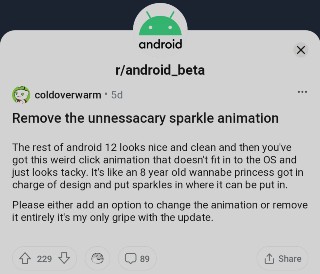
The latter of which has left many Android fans in two different camps. Some question the existence of the new animations while others say that it looks cool. Here’s an example of the new animation that was shared on Reddit:
Many users who’re against the new change have voiced their opinions on social platforms such as Reddit. Some even thought that the new animations were a result of a rendering bug.

what the hell is with the new tap animation thing or whatever it’s called? it’s not very bad, but could definitely do some polishing in futher updates (Source)
the one change I can’t stand is the “highlight effect” that is like a dithered 1990s pixely gradient. It doesn’t fit in with the flat paper matte design aesthetic of material design at all. (Source)
So what are you all thinking about the new sparkling ripple effect? I just filed it as a bug, because i thought it’s a bug in the GPU. But unfortunately it’s part of the new design. (Source)
Android developers confirmed that this new animation will be enabled by default everywhere. App developers won’t have to do anything to enable the effect in their apps.
This means that unless app developers manually disable the new sparkles or starry animation effect in their apps on Android 12, you’ll be seeing this effect each time you tap on an interactable element in an app.
It’s clear that Google is trying something new with Android 12 but the new ripple effect with sparkles/stars isn’t the best idea, to say the least.
Having said that, we’d like to know what your opinion on the matter is. Do you think the sparkles/stars (tap animation or ripple effect) in Android 12 Beta 1 are kind of ugly and out of place?
Let us know by voting in the poll below. The results will be out in a week’s time.
Update 1 (June 1)
The votes are in and it’s clear that Android users agree that the new sparkles/stars animation in Android 12 beta 1 is ugly. The option garnered 73.9% of the votes.
On the other hand, 13% say that the new animation is good, 8.7% say that it needs polishing, and 4.3% are undecided.
Update 2 (June 7)
Google has reportedly committed to making the ripple effect in Android 12 feel less glitchy. Now, this is something everyone can appreciate.
Update 3 (June 10)
With the release of the Android 12 Beta 2 update, these stars animations seem to have been axed altogether.
The ripple effect seems to be basically gone? pic.twitter.com/7IyI1Tlq7w
— Mishaal Rahman (@MishaalRahman) June 9, 2021
PiunikaWeb started as purely an investigative tech journalism website with main focus on ‘breaking’ or ‘exclusive’ news. In no time, our stories got picked up by the likes of Forbes, Foxnews, Gizmodo, TechCrunch, Engadget, The Verge, Macrumors, and many others. Want to know more about us? Head here.

![[Updated] Do you think Android 12 beta 1 sparkles/stars (tap animation or ripple effect) are kind of ugly & out of place? [Updated] Do you think Android 12 beta 1 sparkles/stars (tap animation or ripple effect) are kind of ugly & out of place?](https://stage.onepluscorner.com/wp-content/uploads/2021/05/android-12-featured.jpg)

