The Mi Community has to be one of the most active smartphone communities ever. Typical forums are usually limited to bug resolution as expected, but the Mi Community spices things up by acting as a hub for all the latest developments and even periodically organizing giveaways.
Nonetheless, the Mi Community app and site have largely remained untouched even with the major interface re-design brought forward with the MIUI 12 update. This caused them to appear out of place among all the other updated system apps.
But that is set to change, at least for the app, with the latest Mi Community app update that has brought forward a huge visual revamp and also brings forward several new features.

For starters, as already pointed out, there is a brand new interface that goes much better with the overall aesthetic of MIUI 12. Elements have been made a tad larger with greater use of rounded corners.
Additionally, the tabs displayed at the bottom of the app have seen some changes. The ‘Home’ section has been rebranded as ‘Headlines’ and continues to provide the same utility as it did before.
But there is now a fresh ‘Discover’ tab that lets users view a feed of sorts that is not too different from typical social media feeds.

Furthermore, the changelog claims that the app has also undergone some under-the-hood improvements to make it more responsive. All this and more has been mentioned in the changelog given below:
1. The fundamental system has been changed to make it more responsive.
2. Brand new UI layouts.
3. ‘DISCOVER’ section to give you access to more topics where you can share your living moments.
4. Uploading short videos directly to Mi Community App.
5. New search function.
So yeah, in brief, the entire app has undergone a complete overhaul. If you are interested in trying it out, then just head over to the Google Play Store > My apps & games and check for updates.
The update is being pushed through the Google Play Store in a phased manner. If you haven’t already received it, then you may also force a manual installation by downloading it through this link.
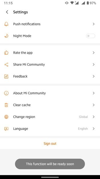
Nonetheless, it is worth mentioning here that along with a few feature additions, some crucial existing features have been disabled temporarily – the most noticeable being a dedicated dark mode.

As clear from above, the switch is not togglable anymore but trying to toggle it does throw a toast notification saying that the feature will be available soon. The same can be assumed about all other features as well of course.
Anyway, if you happen to be a Poco user then don’t feel lost as you will be pleased to know that Poco has come up with their own Poco Community site and Poco Store app after going independent.
PiunikaWeb started purely as an investigative tech journalism website with a main focus on ‘breaking’ or ‘exclusive’ news. In no time, our stories got picked up by the likes of Forbes, Fox News, Gizmodo, TechCrunch, Engadget, The Verge, MacRumors, and many others. Want to know more about us? Head here.


