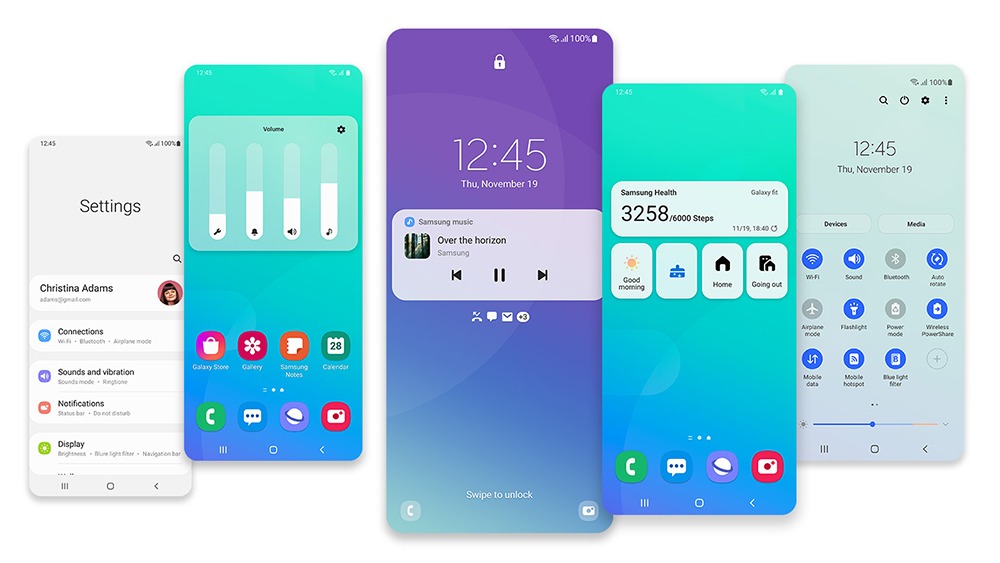
Samsung’s One UI 3.0 is based on Android 11 which means that One UI incorporates most of the new Android 11 stuff into its OS. This includes features like a separate section for conversations, chat bubbles, and more.
However, not every new feature introduced in the skin has originated from Android 11, as there are a bunch of Samsung specific goodies too. And one of them is an entirely new way of how split-screen works.
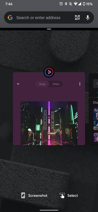
As phones grew larger and larger, Google decided to put all that extra screen estate to good use. Thus, enter the split-screen functionality introduced with Android Pie that allows users to exploit large displays to their full potential, and use two apps at once.
And while this feature has remained largely the same since Android Pie all the way to Android 11, one can’t deny that the process of going into split-screen is a bit lengthy and cumbersome.
Hence, the geniuses at Samsung came up with an innovative way to create app pairs in split-screen mode. Such pairs show up as a single app in the recents menu allowing users to very intuitively switch between them.
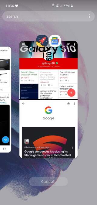
The advantage of this implementation is that users no longer have to set up a pair of apps they use together often each and every time. Instead, one can have multiple app pairs and switch between them easily.
That said, not everyone is buying the new feature. This is because when in split-screen, One UI 3.0 classes a duo as a single app. And that’s how they show up in the recents menu as well.
Moreover, one can’t change the bottom/top app within the multitasking menu. Instead, they truly do get reduced to a single app. All this has proven to be counterintuitive for many and has hence led to a slew of complaints.
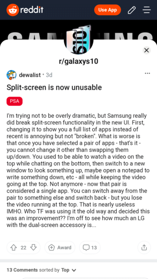
Does everyone else have this issue, when in split screen One UI 3.0 classes it as paired apps and you can’t change the bottom app within the multitasking menu which is the way it should work. I’ve just tested split screen on a Pixel 4a with Android 11 and it works how it should, I think Samsung has messed this up.
Source
The new Samsung software update really sucks. The split screen features is not as flexible as before. Please return the flexible split screen features @SamsungMobile
Source
Obviously, a major change like this can never please everyone. There are plenty of people that are loving the new implementation as well. Therefore, Samsung should’ve at least added an option to switch between the two split-screen methods.
Or they could simply allow the alteration of the split-screen app pair without having to create an entirely new pair. This way, everyone will be pleased.
Anyway, for now, be sure to check out our dedicated One UI 3.1 update tracker, now that you have made it to One UI 3.0. You can check your device’s eligibility and update status through the same.
PiunikaWeb started purely as an investigative tech journalism website with a main focus on ‘breaking’ or ‘exclusive’ news. In no time, our stories got picked up by the likes of Forbes, Fox News, Gizmodo, TechCrunch, Engadget, The Verge, MacRumors, and many others. Want to know more about us? Head here.

