This story is being continuously updated…. New updates are being added at the bottom…..
Original story (published on September 04, 2020) follows:
Right off the bat, OnePlus appears to have taken some inspiration from Samsung’s One UI for its upcoming OxygenOS 11 update. In early August, the company released the third Android 11 developer preview build for the OnePlus 8 and 8 Pro.
And with its release, the company also introduced a bunch of new features as well as an overhaul to its user interface. Of course, OnePlus didn’t just simply say they got their inspiration from One UI.
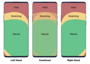
Instead, the company released a post on the OnePlus community forum titled — A Peek Inside OxygenOS 11. In the post, the company highlighted the factors that made them redesign OxygenOS 11 to offer better one-hand usability.

Furthermore, in an interview with Android Authority, Sam Twist, Senior Product Manager at OnePlus offered deeper insights into some of the design choices that were made while redesigning OxygenOS 11.
Starting off, Twist spoke about one of the main factors for the UI overhaul other than better one-handed usage. This has to do with the elements in the UI and how they appear on bigger screens.
A lot of the elements, if you look at Oxygen OS 10, are just kind of pushed into the corner. When you look at them on the screen, a bigger screen, certainly, it maybe doesn’t feel as natural, we’re kind of losing a bit of information and maybe not using that fantastic screen size to the best of our ability.

This suggests that OnePlus wants to take full advantage of the ever-increasing screen sizes on phones to offer a better viewing experience. And when asked about the redesigned Gallery app in OxygenOS 11, Twist said the following:
There’s actually a machine learning algorithm which will detect what it thinks are the best photos and it will make them larger, and kind of create this tiled mosaic of photos. Generally, there’s less whitespace as you use the Gallery because all the photos have been kind of expanded or compressed to create more of a magazine-style.
What this means is that images in the Gallery will not appear in a fixed size as we see in many other stock Gallery applications from different OEMs. Further, the application now also offers better one-handed usability since all interactive items have been shifted lower.

Twist also mentions that OnePlus is trying to make sure that users get the necessary information as quickly as possible without wasting too much time. Thus, with OxygenOS 11, the design language takes into account the ‘hierarchy of information‘ displayed.
In Oxygen OS 10, we felt that [the] hierarchy of information wasn’t really there. When people look at the screen, they just have to gaze there for longer to get the sort of information that they want. But with [Oxygen OS 11], it’s all about that contrast and colors [and] hierarchy of text size, which allows you to kind of gain that information [quickly].
Of course, by redesigning OxygenOS 11, OnePlus has got rid of the Stock Android-like appearance that many OnePlus users enjoyed. However, it appears that the company is open to feedback and may tweak certain elements before the stable version rolls out.
That said, OnePlus recently released Android 11 beta 4 for the OnePlus 8 series which brings along some bug fixes and optimizations. It’s probably the last closed beta update since beta 3 was previously expected to be the last.
We can expect to see OnePlus release the stable Android 11 update soon after Google for certain eligible devices. Therefore, keep an eye out on our dedicated tracker to know when the OxygenOS 11 update based on Android 11 arrives on your device.
Update 1 (September 23)
In a recent interview, Sam Twist, Product Manager at OnePlus, shed some light on a few more details regarding the OxygenOS 11 update. For starters, some India-specific features such as Work-life balance and the OnePlus Scout are scheduled for a roll-out world over.
Further, when asked about the inconsistencies with the menu options, Sam claimed that “We want the power to lie with the user and provide as many options as we can to create a more intuitive experience.”
PiunikaWeb started as purely an investigative tech journalism website with main focus on ‘breaking’ or ‘exclusive’ news. In no time, our stories got picked up by the likes of Forbes, Foxnews, Gizmodo, TechCrunch, Engadget, The Verge, Macrumors, and many others. Want to know more about us? Head here.

![[Updated] OnePlus OxygenOS 11 (Android 11) Gallery app whitespace, hierarchy of information displayed, & more demystified [Updated] OnePlus OxygenOS 11 (Android 11) Gallery app whitespace, hierarchy of information displayed, & more demystified](https://stage.onepluscorner.com/wp-content/uploads/2020/09/oneplus-oxygenos-11-featured.jpg)
