Yesterday, Tumblr pushed out a new update. It was a major change as it affected the look and feel of the platform.
We covered this news in detail yesterday, but if you want a quick idea, the change – which has been done to stay inline with the Web Accessibility Initiative of the World Wide Web Consortium – is aimed at making menus more accessible, fix poorly described elements, and improve overall readability.
In addition to these, the update also changes the platform’s color contrast. Here’s how Tumblr explains it:
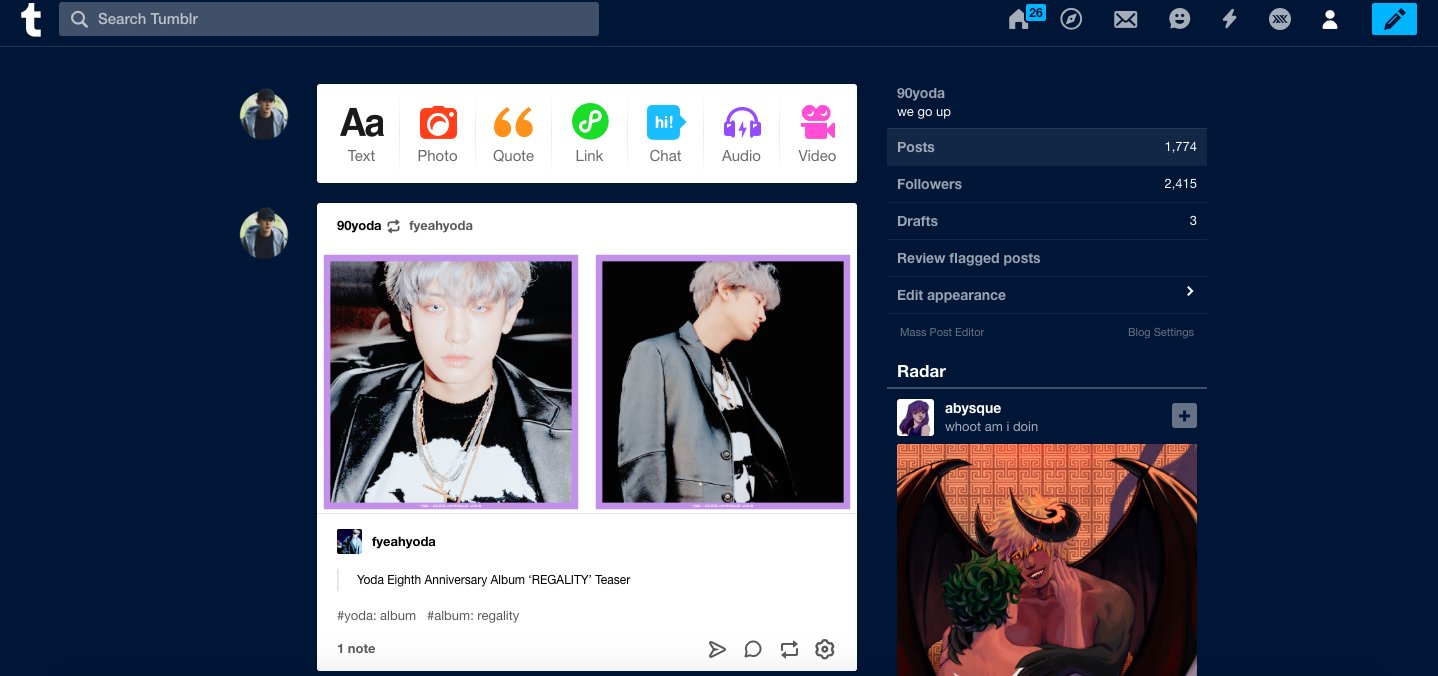
Part of making Tumblr more accessible involved upping the color contrast in our UI, most notably on the dashboard and everywhere else that familiar blue touches. The light grays and muted blues had a contrast ratio of 2.02:1. What does that mean? Bad. It was bad, and we needed to do better by people with visual impairments
While we already reported early indications in our story yesterday, now we’re seeing a lot of reports that suggest this change related to color contrast hasn’t gone down well with a lot of users. Most of them say the new blue isn’t good as the contrast isn’t eye pleasing.
Take a look at some reports:
https://twitter.com/sh0rtysquadperi/status/1090766671852331008
https://twitter.com/hermioncgrangcr/status/1090757221603000321
https://twitter.com/encxant/status/1091022636904267777
https://twitter.com/Seventuss/status/1090684896790659073
https://twitter.com/herligisak/status/1090934484508266496
Check out more such reports by heading here.
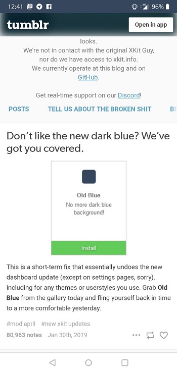
Now that Tumblr has forced the new layout and many users aren’t happy, is there a way out? Well, fortunately yes. Ever heard of Xkit? It’s a small extension framework that powers tweaks for Tumblr.
Xkit has already been popular among Tumblr users and with the recent UI update, it has started gaining a lot more attention as they’ve come out with an ‘Old Blue’ extension that reverts back your Tumblr’s look and feel to what it was earlier.

Some Tumblr users have already started using this extension and are quite happy with it:
https://twitter.com/flintsjames/status/1091039941256269824
https://twitter.com/qiliin/status/1091114531970076672
https://twitter.com/SpyzViridian/status/1091081277963411458
So if you aren’t liking the new Tumblr UI, we suggest you give Xkit’s Old Blue extension a try. Oh, and yes, do share your experience with us in the comments section below.
NOTE: PiunikaWeb has covered in detail the Tumblr adult content ban as well as the platform’s alternatives, check out all updates here.
PiunikaWeb is a unique initiative that mainly focuses on investigative journalism. This means we do a lot of hard work to come up with news stories that are either ‘exclusive,’ ‘breaking,’ or ‘curated’ in nature. Perhaps that’s the reason our work has been picked by the likes of Forbes, Foxnews, Gizmodo, TechCrunch, Engadget, The Verge, Macrumors, and more. Do take a tour of our website to get a feel of our work. And if you like what we do, stay connected with us on Twitter (@PiunikaWeb) and other social media channels to receive timely updates on stories we publish.


